Gone are the days when UX/UI designers ran for the door when their firms announced projects with financial institutions. While the financial sector was known to be a dinosaur when it came to web/app design and experience, many financial companies are forced to abandon their ancient design comfort zones in order to survive. In the last 10 years, a surge of fintechs has fuelled design, UX, and UI innovation, allowing them to take market share from traditional financial organisations.
Africa’s fintech design leaps
While the UK and the US are credited as the birthplaces of fintech design innovation, interestingly Africa’s M-Pesa has been one of the first pre-global financial crisis fintech companies. M-Pesa’s goal was to solve a big problem, to provide financial inclusion to un/underbanked communities lacking access to banks and traditional financial products. Although fintechs grew with smartphone adoption, M-Pesa initially offered virtual banking services through a simple SIM card to mobile phone users, giving financially excluded communities financial freedom and life quality improvements. Africa’s fintech innovation was driven by the need to resolve many financial pain points, making many of their innovative solutions ahead of the times.

Today, the fintech sector has set the bar high when it comes to UX/UI design. The industry has established itself as a design leader by abandoning outdated and complex legacy practices while adopting effective and user-friendly designs and practices. Fintech apps now serve as examples for many industries of how effective UX/UI can completely transform the customer experience, improve the customer journey, and increase loyalty.
Let’s take a look at what Fintechs are doing right in UX design:
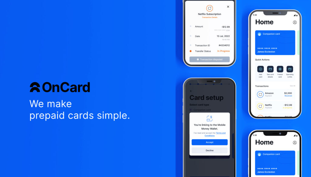
1. Less is more - simple and digestible fintech design
Digital financial products (along with the ops processes) can be complex and confusing for customers to understand. To address that, website and app designers have to incorporate a user-centric approach taking the following questions into consideration:
- Is the provided information exhausting and/or overwhelming?
- Is complex financial data presented in a simple and easy-to-digest way?
- Are users able to easily find the necessary information to perform the desired action?
- Are calculations presented in a meaningful and educational way?
Data visualisation tools such as graphs and pie charts are pivotal in presenting complex information in a digestible way. Users no longer have the capacity, or attention span, to read confusing and dense explanations. A quick glance at a simple yet visually appealing infographic is enough to relay all the necessary financial information. Not only does this improve the visual appeal and aesthetic, but it also retains users and boosts engagement.
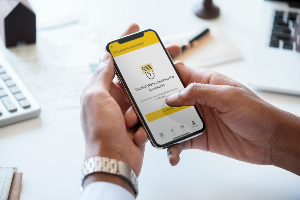
2. Double-edge friction sword
Friction is an app and website killer. Anything that prevents a user from accomplishing their goal increases the chance of abandoning the app altogether. Designers must create a smooth and seamless process that matches a user’s natural sense of order and logic.
Providing users with a frictionless process is something that fintechs have excelled at. Incorporating KYC protocols into the onboarding journey has made it a lot easier for users to sign up and use digital financial tools while fulfilling a fintech’s compliance protocols. Other processes, on the other hand, should not be so easy. Adding some friction serves as a protective layer, especially where financial mistakes and losses can be made. Creating a process with “the right level” of friction adds a safety net preventing a user from making an irreversible mistake.
3. Trust and transparency
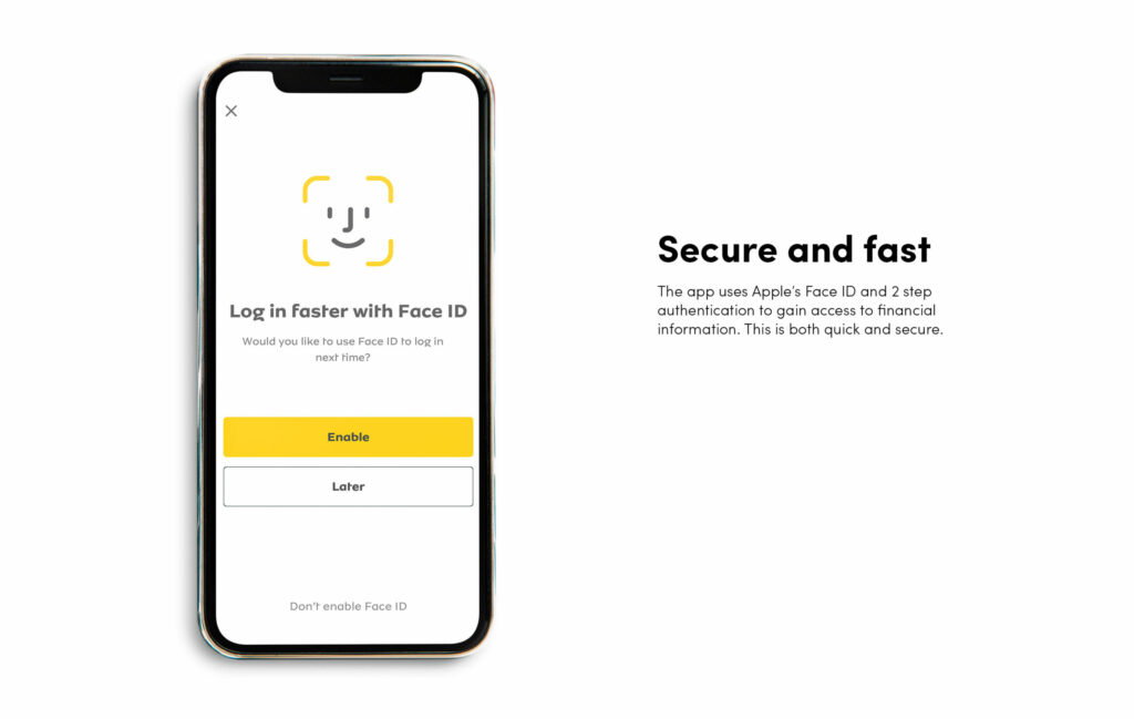
Simple and clear communication throughout a digital journey gives users trust as they confidently navigate their transactions. A user cannot be left to wonder whether their action has been performed or effective. They must always understand where they are in the process in order to avoid confusion or duplication which can lead to app abandonment. To avoid frustrations and app distrust, designers must incorporate the following into their design:
- Provide simple and clear information about where users are in their process and what each action accomplishes.
- Guide the user through their journey by explaining the outcome of each step.
- Show the user’s progress such as verification, evaluation status, or document uploading.
- Incorporate encryption, biometric security, etc to ensure the user feels their information is safe.
4. Engaging, conversational, and personalised user experience
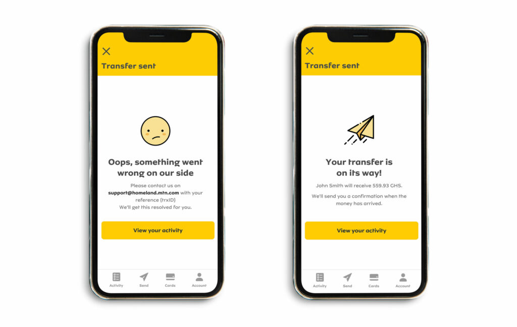
Users are tired of dull and formal tones, as they tend to overwhelm, confuse, and bore them. Today’s fintech apps have incorporated personalized user design and communication that transmits positive emotions and interactions in their users’ language. Here are some additional tips for creating an engaging and personalized user experience:
- Use visuals, illustrations, iconography, animations, and micro-interactions.
- Microcopy tone should be conversational, making users feel they are guided through the process instead of feeling burdened.
- Process flow must be smooth and clean. Thoughtful minimal design is more effective than overloading the interface with pointless text and features.
- App design has to be aligned to business goals and target audience.
5. Finetch design leading to positive behaviour & habit formation for the user
Today, it’s not enough to design an app that gives users expected functions and information about their finances. Designers must go a step further and provide functions that help users make the right decisions. Many apps are providing value-added services to encourage positive habits with the following strategies:
- Offering rewards for accomplishments, positive behaviors, or completing educational content.
- Adding alarms or friction layers when users engage in “negative behavior” such as overspending or not meeting their goals.
- Using gamification to educate or earn rewards and badges.
6. Focus on emotions
With so many product and service apps to choose from, the ones that stand out focus on having an emotional connection with their users. Fintechs, among other industries, have tapped into this by showing they care about their customers rather than using self-promotional tactics to talk about products and services.
Apps and websites that stand apart from the masses focus on purpose-driven, human-centred and soulful design that relates to human values while empathising with the needs and pain points of end users at each step of the product design. This means there has to be a mindset change where with every design project, priority must be given to serving over selling, emotions over information, solutions over features, disruption over protection, and flow over fragmentation. This ensures the design approach is always human-centred gaining the trust and loyalty of end users.
Fintech design conclusion
Developing and creating any app is no easy task, and in today’s oversaturated landscape user-focused and empathetic UX/UI design helps companies stand out in the sea of competition. If you are creating a new fintech or need to re-evaluate your current UX/UI design and processes, Bridge Studio can help you with your branding and user experience needs to not only connect with but also retain your audience.
Written by Juliya Obukhovskaya, Bridge Studio content writer.

No comments.