
I thought it would be a good idea to start the year off on a negative note. There have been a ton of negative things that have happened over the past few years but the world of fintech and UX seems to have escaped, if you discount all that crypto malarkey. Therefore in the interest of equality I’d like to redress the balance by pointing out some of the UX mistakes made by fintechs.
Arse covering disclaimer part
Often there are very good reasons for these so-called UX “mistakes”. Mistakes are a vital part of success and progress, I’ve made a fair few in my career. One cost a multinational £30,000 but hey, that multinational went on to sue the NHS, so I don’t have any guilt there. This post isn’t meant to have a dig at the designers of these apps, as we all know, some decisions are beyond their control.
Some common fintech UX cock-ups
Lack of clarity and simplicity
One of the most common UX mistakes made by fintechs is making their products or services too complex for the average user to understand. Financial products can often be difficult to understand for the average person, so it's important for fintechs to clearly explain their offerings and make it easy for users to navigate their platforms. This can be achieved through the use of clear and concise language, as well as intuitive design elements that guide the user through the process.
One example of a lack of clarity is the Assets page on Coinbase, which is otherwise an excellent app! When viewing your balance it’s not clear if your balance increased because you added credit to it or if the market has risen. It would also be a nice touch to see when you added credit to your account on the graph somehow. Perhaps there is a history section somewhere but it was too taxing for my 3 second attention span brain to find.

Poor onboarding experience
Onboarding is the process of introducing new users to a product or service, and it's crucial for fintechs to get it right. If the onboarding experience is confusing or frustrating, it can lead to a high churn rate (the percentage of users who stop using a product or service). Fintechs should aim to make the onboarding process as smooth and seamless as possible, with clear instructions and guidance to help users get started.
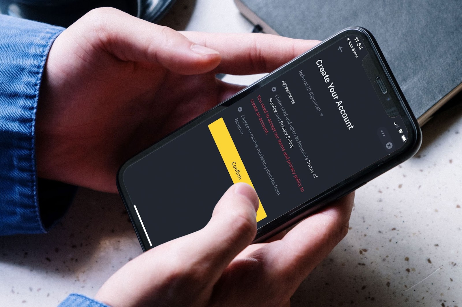
I’ve often struggled with Binance and binned the app a while ago. I downloaded it again, for the purpose of this post, and I instantly hit a roadblock. You come to a point where you have to confirm you’ve read the T&Cs and it's not obvious how you do that. You have to tap the small grey circles to the left but they don’t look clickable. They are also smaller than most fingers and thumbs. This problem could have been identified with some basic user testing.
Inadequate security and privacy measures
In the financial industry, security and privacy are of utmost importance. Fintechs that fail to properly protect their users' sensitive information can suffer serious consequences, both for their finances and reputation. It's essential for fintechs to implement robust security measures, such as encrypted data transmission and multi-factor authentication, to protect their users' information. Additionally, fintechs should be transparent about their privacy policies and clearly communicate how they handle user data.
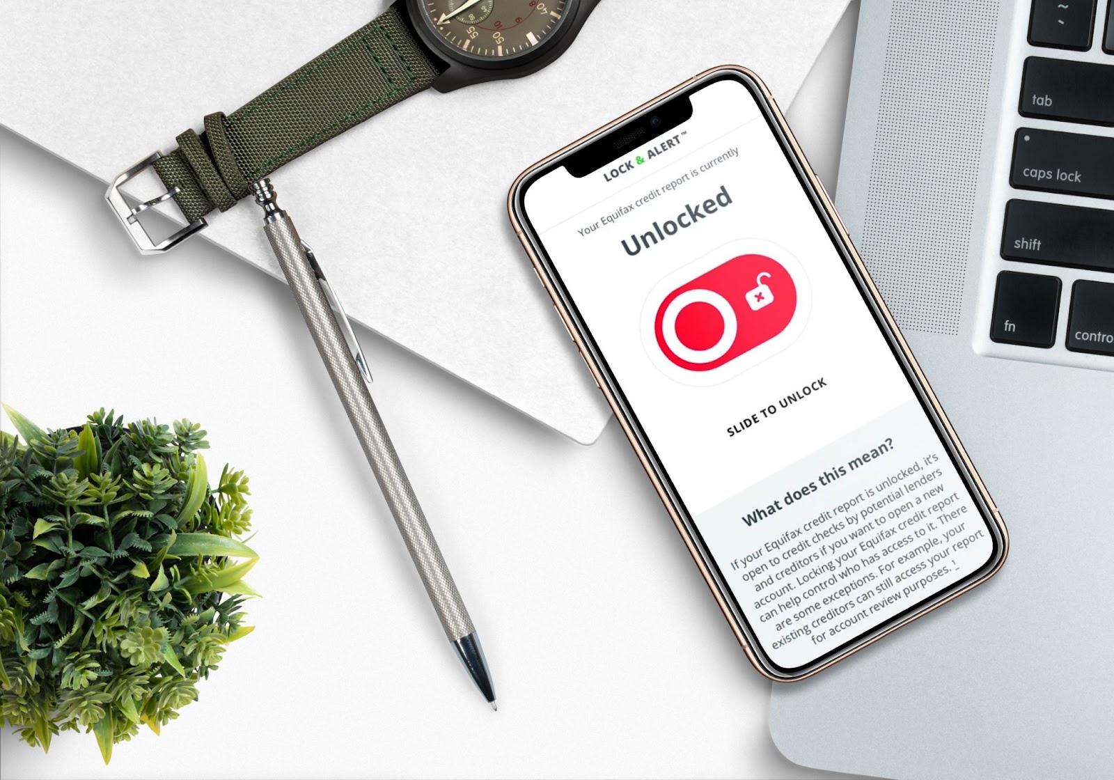
A vulnerability in the Equifax website was left unresolved due to failures in Equifax’s internal processes. Equifax also failed to renew an encryption certificate on one of their security tools. This allowed hackers to extract data in encrypted form for months. This lead to the theft of 143 million US accounts, 200,000 credit card numbers. #ThanksEquifax
Adding too much functionality
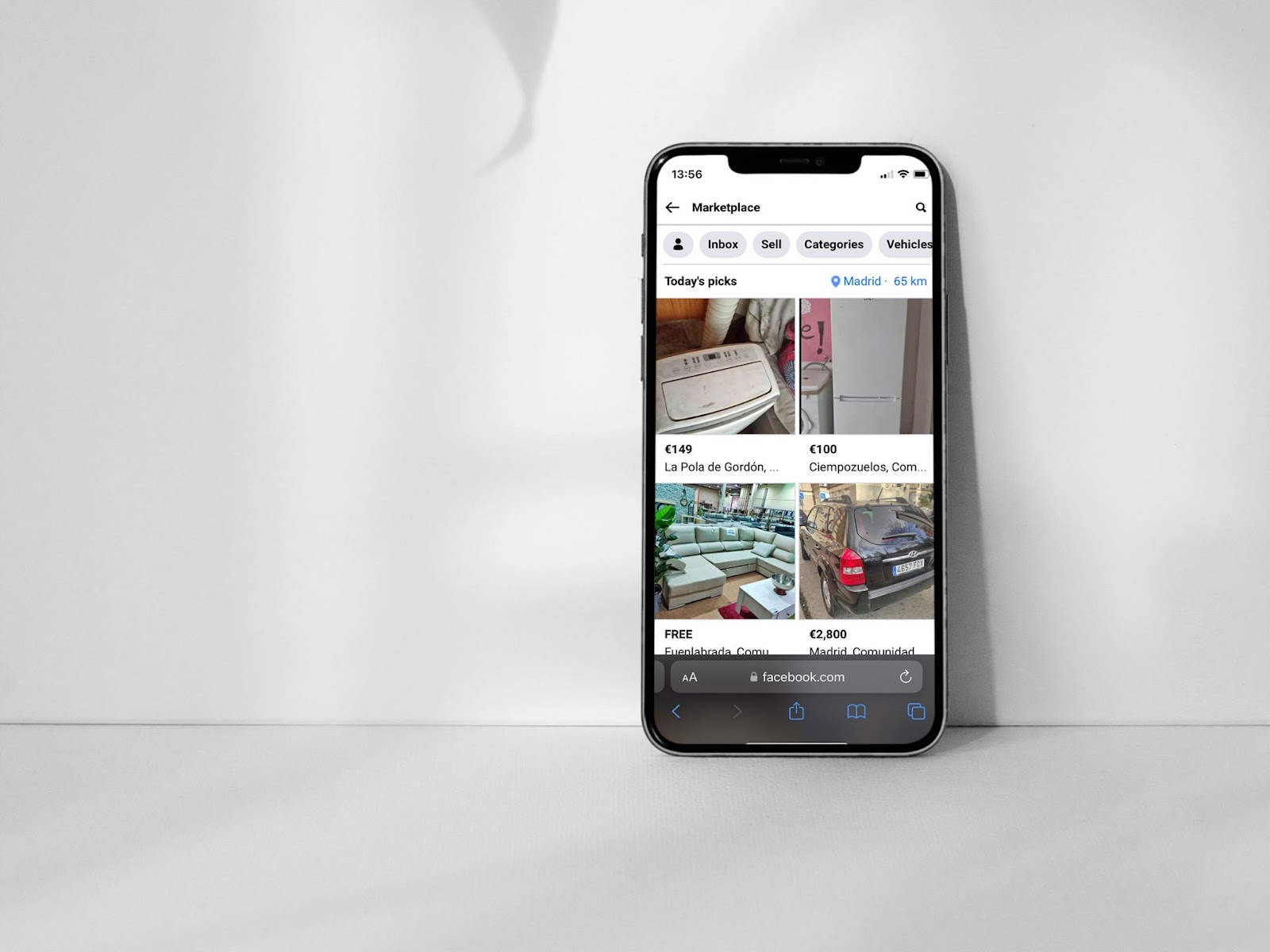
Adding too much functionality in an app can lead to confusion and a cluttered user interface. It can also increase the learning curve for new users and make the app more difficult to navigate. It is important to focus on providing a clear and streamlined experience for the user, rather than overwhelming them with unnecessary features. There are only rare occasions when a digital product that does just about everything actually works. Facebook’s Marketplace has had some limited success and super apps like WeChat in China are popular but there are specific reasons for that. In most EU and North American countries an app that does everything would make for a pretty poor fintech UX.
You secretly hate users with disabilities
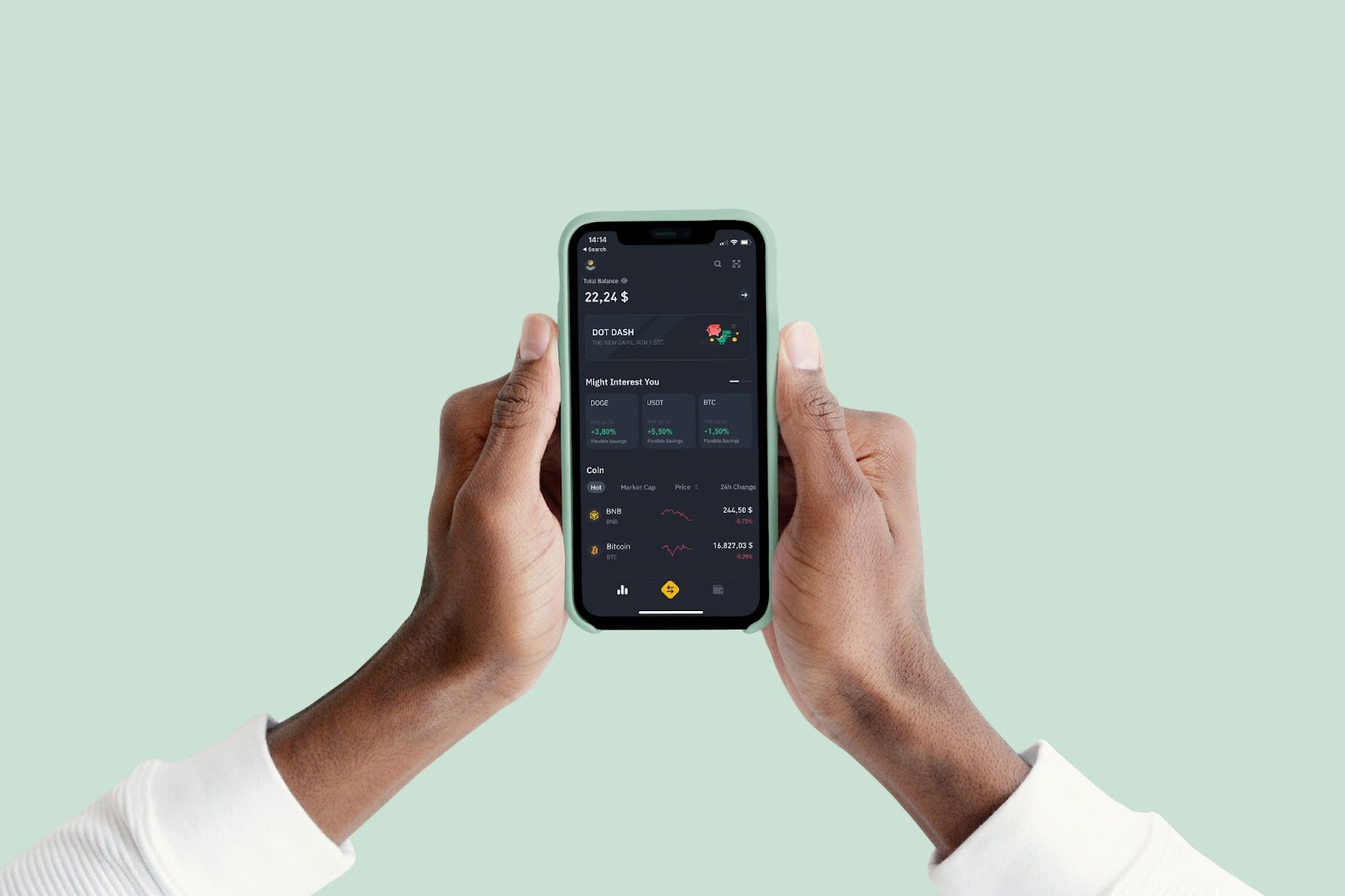
Fintechs should also ensure that their products and services are accessible to users with disabilities, such as visual impairments or mobility impairments. This includes providing options such as screen readers, large font sizes, and easy-to-use controls for users with visual impairments, as well as making sure that the platform is easy to navigate for users with mobility impairments. Having said that, it is a challenge to make the app visually appealing and meet accessibility guidelines. At times it feels like the only accessible colours are black, white and blue. Here you can see how Binance would fail an accessibility check on the colour contrast and size of the typography. It looks great but f-you if you have low visibility.
Fintechs have the potential to revolutionise the way we manage our finances and make it easier for everyone to access financial services. However, it's important for these companies to avoid common UX mistakes and prioritise the needs and satisfaction of their users. By focusing on clarity, simplicity, onboarding, security and privacy, mobile optimisation, and accessibility, fintechs can create a positive and seamless experience for their users.
Other fintech UX sins
It's important to note that every product or service will have its own unique set of challenges and opportunities when it comes to user experience design. However, here are a few more examples of fintech apps that have sinned in the face of the UX gods:
Robinhood is a popular stock trading app that has faced criticism for its complex and confusing user interface. Some users have reported difficulty navigating the app and understanding certain features, which can be frustrating and lead to a negative experience. Additionally, the app has faced controversy over its gamification of stock trading, which some critics argue can encourage risky behaviour.
Venmo is a popular peer-to-peer payment app that allows users to easily send and receive money. However, the app has faced criticism for its confusing navigation and the fact that it's often cluttered with too much information. Some users have also reported difficulty understanding certain features and the fees associated with using the app.
Cash App is another popular peer-to-peer payment app that has faced criticism for its confusing user interface. Some users have reported difficulty understanding certain features and navigating the app, leading to a frustrating experience. Additionally, the app has faced controversy over its security and privacy practices, with some users reporting unauthorized transactions on their accounts.
Again, it's important to note that these are just a few examples, and it's not uncommon for products and services to face challenges or criticisms when it comes to UX. The key is for fintechs to continuously listen to feedback from their users and strive to improve the user experience of their products and services.
How to correct fintech UX mistakes
One way to correct these mistakes is with a UX heuristic evaluation. This is basically an evaluation by a UX designer experienced in spotting mistakes by using a set of guiding principles. It’s extremely useful to have an outside set of eyes look over your app or website. It’s often the case that your in-house team would have been working so closely on the design that they find it hard to spot errors a fresh pair of eyes would. Here at Bridge Studio we’ve developed our heuristic evaluation guide. If you think you’d benefit from an heuristic UX evaluation feel free to contact us for a free consultation call.
No comments.