Hostelworld, as the name cunningly suggests, is an online hostel booking site. Since it started way back in 1999 the company has gone from strength to strength and is now the leading hostel booking provider.
When backpacking around Latin America, the Hostel World app became my favourite means of booking a bed for the night. Far superior than dubious recommendations from the Lonely Planet, plus with the space saved by not carrying a guide book, I could fit another bottle of tequila into my already bulging rucksack. However, their brand seemed to blend into the noise of their competitors and felt detached from the people using it. The rebrand aims to combat these issues.
The new look focuses on how people's experiences of hostels and traveling are very much determined by who they meet. This is reflected in the strapline ‘Meet the world’, hand rendered in a paint brush script, conveying the spontaneous nature of its customers. This fluid, rough-and-ready style sits well with the experience I had while backpacking.
The new photography features ‘real’ people - yes, you can even see their bellies are a bit wobbly as they jump into lakes with the new best mates they met in a hostel last night. I can almost hear them scream, "YOLO!" The photos are still pretty polished but that does reflect how many modern hostels are actually quite stylish these days. The photography on their website is described as ‘gritty’, although I’d have to disagree with this. I couldn’t see any photos of backpackers being chased out of town by a Colombian drug dealers or photos of couples having sex in a hostel toilet while someone throws up in the cubical next to them. But perhaps that would be a little too real.

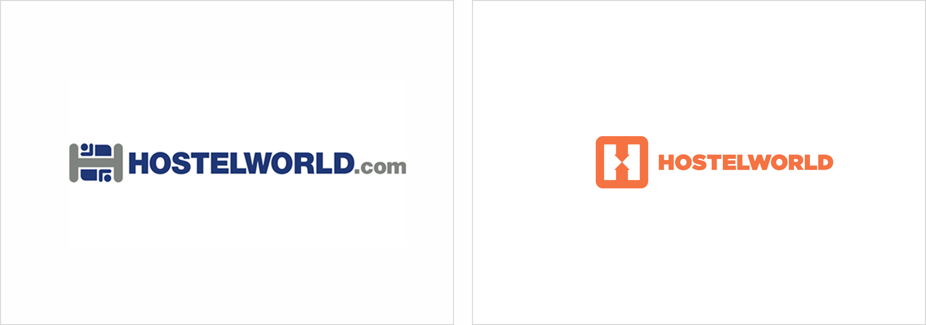
The H logo is made up of two arrows facing each other that symbolises the idea of two people meeting each other or a starting point for an adventure. The concept is pretty simple and effective, although the actual icon feels a little rigid and corporate, which is a contrast to the headline typography. The icon also feels very static, where as meeting people while backpacking is far more coincidental, more bumping into people by chance than a set place and time that it suggests. So the logo feels a bit too Heinrich from Dusseldorf who gets immensely pissed off when your 5 minutes late, when it should be more Juan José from Bogotá who is just so chilled he didn’t notice you were late.
The new orange featured throughout the site feels a lot more youthful and spontaneous compared to the dominant blue used by many accommodation booking sites. It’s good to see a brand take a step away from the norm.
Overall the rebrand is a big improvement on the old version. Although on the website when you get away from the header image the site feels bit generic. Sites like AirBnB go the extra mile with details like custom designed icons giving their look and feel a strong presence throughout the site. So a step in the right direction but the application and follow through of the idea could be better.


I thought the new logo was a little cold.