Atomic Design is a way of organising a design system from small components to large components. These components are referred to as atoms, molecules, organisms, templates, and pages. They all work together to create an effective interface design system. An atom is the smallest building block and combines with other atoms to form molecules. A button is considered to be an atom and when combined with other elements like an input field it will create a form which is considered to be a molecule.

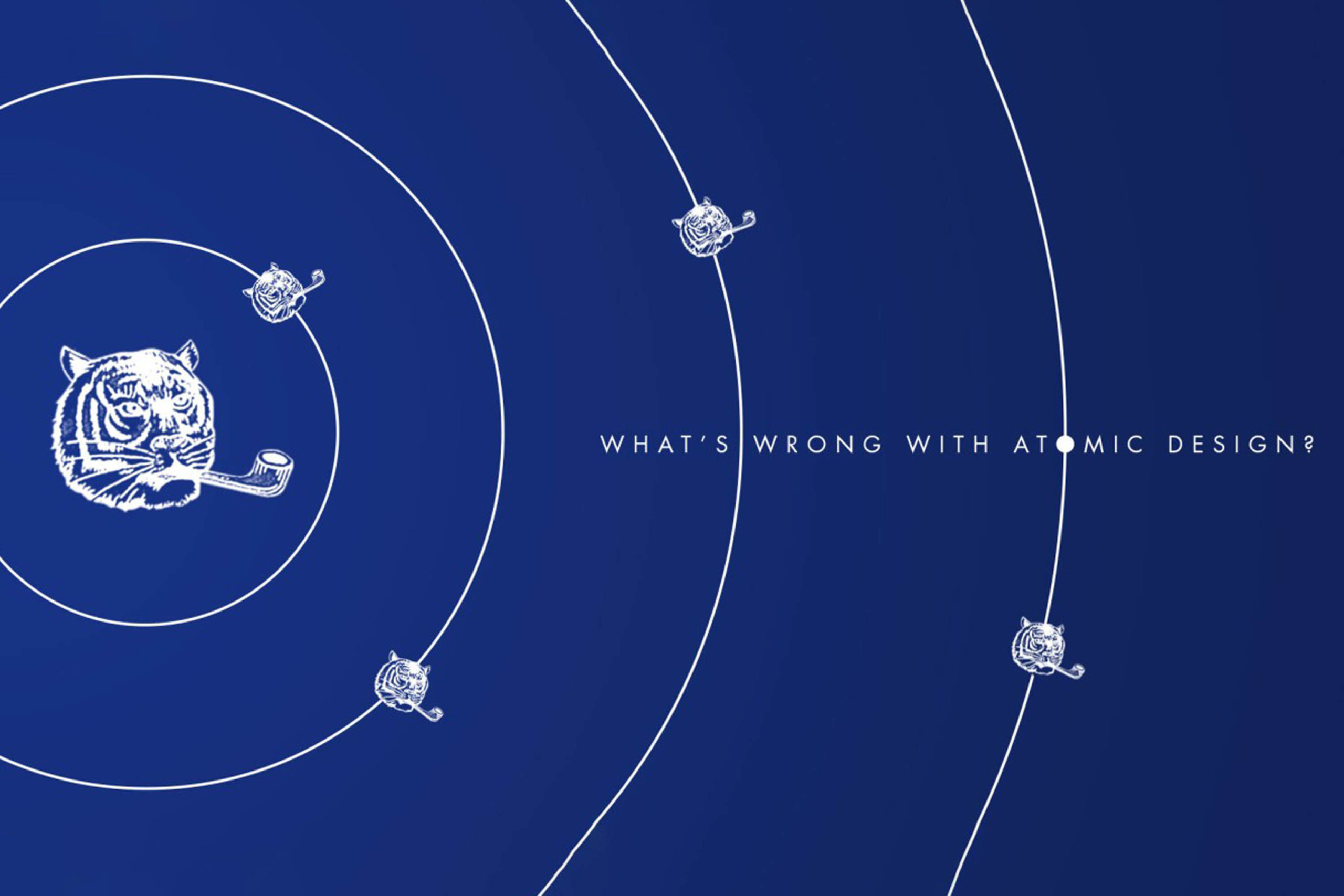
The Atomic Design System Flaw
Sounds great eh? But wait, Atomic Design has one flaw that makes it difficult to work with.
So you've organised your design components into atoms, molecules, organisms, templates and you feel like some kind of design god. Then you come to look for those components when building a design like a form on a website. In your design god head, buttons and more complicated things a dropdown button are fairly similar. But according to Atomic Design they sit in two different categories. We have now encountered the problem that is technically know as, "Is this an atom or a molecule, what the hell is it, Jimmy?".
They are both navigational tools that should sit somewhere in the same group but in Atomic Design they are split based on their complexity. It would make more sense to organise components into groups based on their functionality.

At Bridge Studio we encountered this problem when creating a design system from scratch for one of our clients. Atomic Design was actually a useful frame work to use when creating the components. We started with the smallest components then worked our way up to combining them to create more complicated molecules and organisms. However, halfway through this we realised it's flaw. We decided to finish creating the components in this manner and then reorganised them in a more logical way after.
Our design system
This is how we organised our design system for our fintech clients.
Foundation
This is the core of our design system and will effect everything going forward. It contains the following elements:
- Colour
- Typography
- Spacing
- The grid
Components
These are the building blocks we use to create our pages. They are then divided into sub groups based on functionality. This section also include things like modal windows that contain various smaller elements. Here are just some examples components:
- Buttons > Buttons with icons, dropdowns, dropdowns with search, etc.
- Icons
- Input fields > Search, text inputs, date inputs
- Selectors > Check boxes, Radios, Toggles
- Date picker
- Modal popup > basic alerts, popups with text inputs
Components
These are pages that have examples of the most common UI elements. They show how the design system works and also serves as starting templates when creating new designs. Here are some examples:
- Home page
- Sign up page
- Contact page
This is how we went about organising our design system but I'm sure there are many other ways of doing it. This is just what suited us at the time.
Advantages of this design system:
No illogical boundaries between sections.
Disadvantages of this design system:
It can create long lists of components that take a while to search.
At the end of the day design systems are humongous beasts that will take some time to tame. Because of their complex nature they will always be difficult to organise. It does take time to get to know how to use them but if created correctly they will be a great asset for your team.
No comments.