
Improving UX Design in Banking is no mean feat. Fintech companies are increasingly setting the bar high for intuitive and frictionless design. In contrast, traditional banks are struggling to keep pace. In this post, we'll discuss why some banks are lagging behind the competition in the UX department and what strategies they can adopt to catch up. Because who needs a smooth and seamless experience when dealing with something as important as your money, right?
Why some traditional banks lag behind in UX design:
Due to ‘if ain't broke, don’t fix it culture’, established banks are just fantastic at providing a bad user experience. Who doesn't love clunky, outdated systems that require specialist skills and long lead times to make even the simplest changes? And let's not forget the joy of navigating multiple channels and systems just to complete a single transaction or access account information. It's like a fun little game of digital hopscotch!
Marketing departments getting their mucky fingers in the UX design pie
Traditional banks tend to have marketing departments that wield way too much power for their own good. I'm looking at you Jane, VP of ‘I have to make changes to a design of an app to justify my job to my boss’ at Le Gacy Bank.
Marketing departments can cause banking apps to have worse UX by prioritising their own goals over the needs and expectations of customers. When marketing becomes the driving force behind a design it can lead to features that are more focused on promoting ‘special offers’ than providing a seamless and intuitive user experience.
The Spanish bank Kutxa is a frequent offender of marketing getting in the way of a good user experience. Upon logging into the app, a marketing message is presented, but let's be honest, 99% of the time, it's completely irrelevant and uninteresting to you. Thanks Jane.
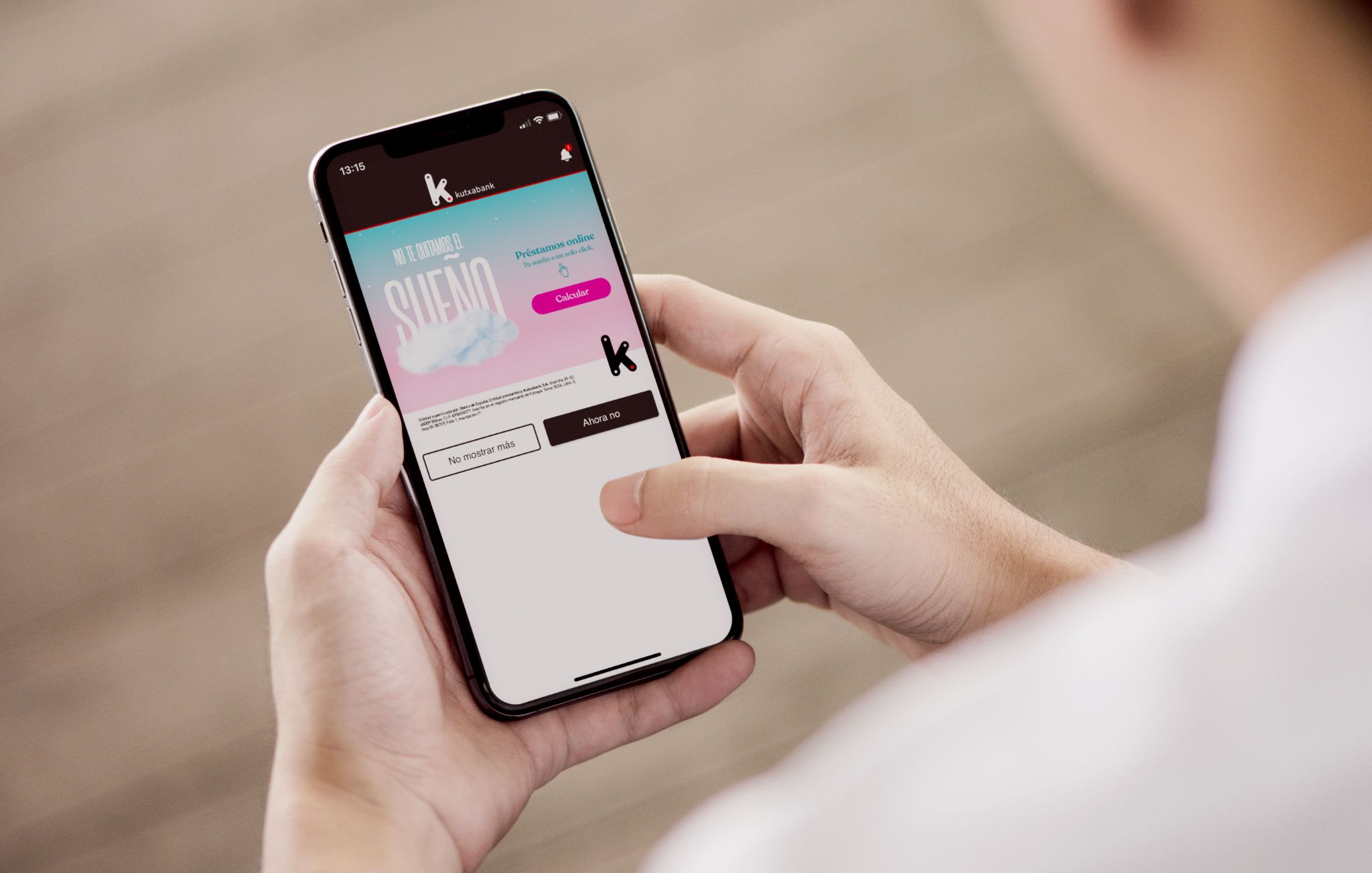
Marketing departments may also insist on adding flashy graphics to the app that serve no real purpose other than to promote the brand or an offer to upsell to the customer. These elements can slow down the app's performance or make it more difficult for users to navigate, leading to a poor user experience. This can be especially frustrating for customers who are trying to complete a transaction or access important account information.
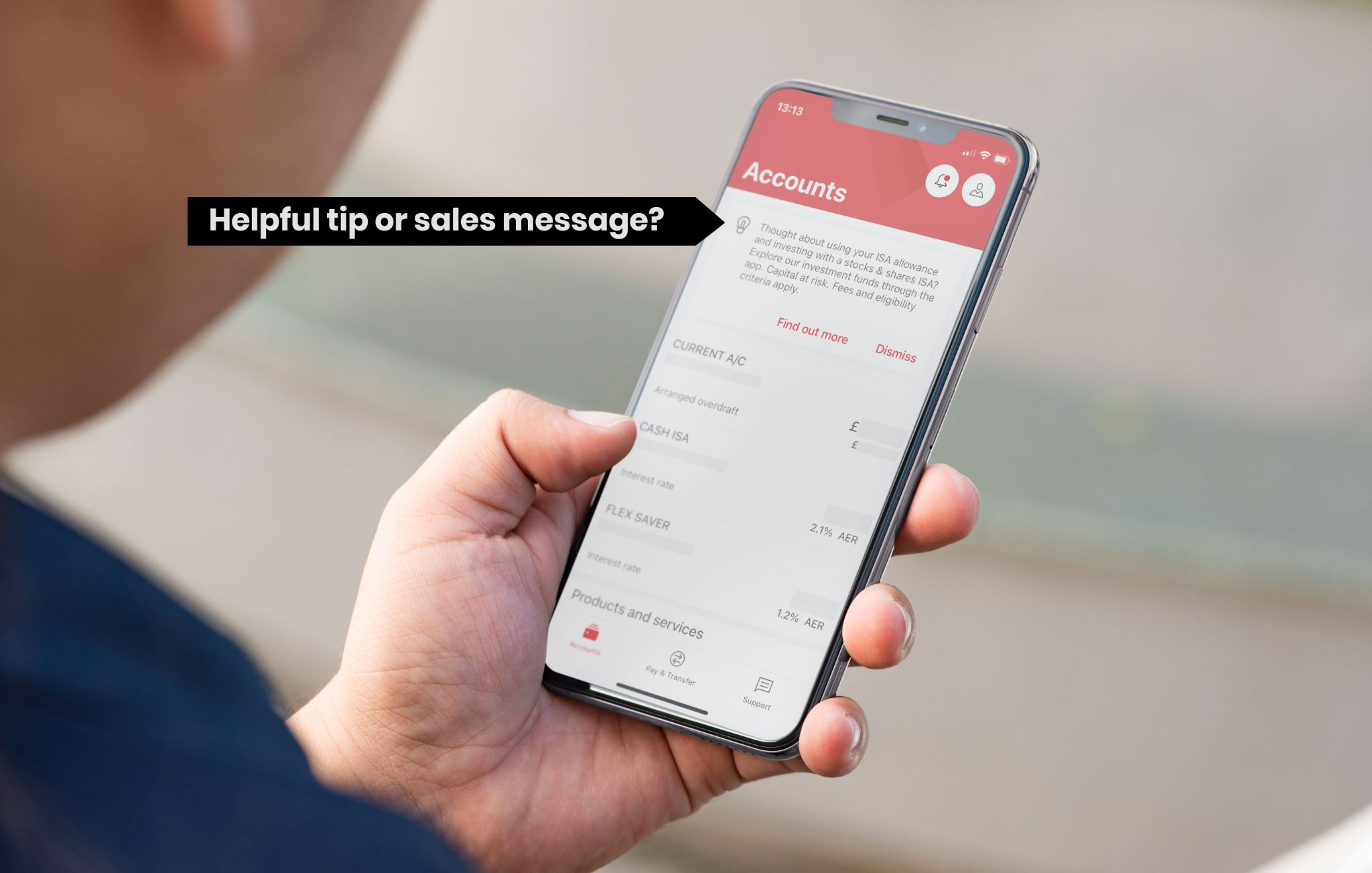
HSBC actually has a very usable banking app but sneaky John from the Business Growth and Marketing department has still managed to disguise a sales message as a helpful tip. Ok, I might be being a bit harsh here, perhaps you really do want to know about their ISAs but generally when I log on to my banking app I want to check my balance or make a transaction. If I did want an ISA I would search for it in the menu. Call me old fashioned but I like my tools to do a job and not sell me things.
Bloated apps that are not improving UX design in banking
Some apps have become bloated due to legacy banks trying to offer too many services. This can be seen in apps that offer a wide range of features that aren't necessarily relevant to their customers, such as investment services or insurance options that customers may not be interested in.
Some legacy banks have tried to integrate investment and trading services into their banking apps to compete with fintech startups that specialise in these areas. However, this can lead to a cluttered user interface and a confusing user experience, especially for customers who are primarily interested in basic banking services like checking and savings accounts.
Moreover, some banking apps have attempted to offer too many ancillary services, such as travel booking or restaurant reservations, that may not be essential to their core business. This approach can lead to a lack of focus and a dilution of the bank's brand identity, as customers may view the bank as trying to do too many things at once. Improving UX design in banking is not only about creating a visually appealing design but thinking about what services you want to offer.
In contrast, digital-only banks and fintech startups have taken a more focused approach, offering a limited number of core services that are designed to meet the specific needs of their target audience. For example, some digital banks focus solely on providing mobile banking services, while others specialise in personal finance management or small business banking. This approach can lead to a more streamlined and intuitive user experience that is better suited to the needs and expectations of customers.
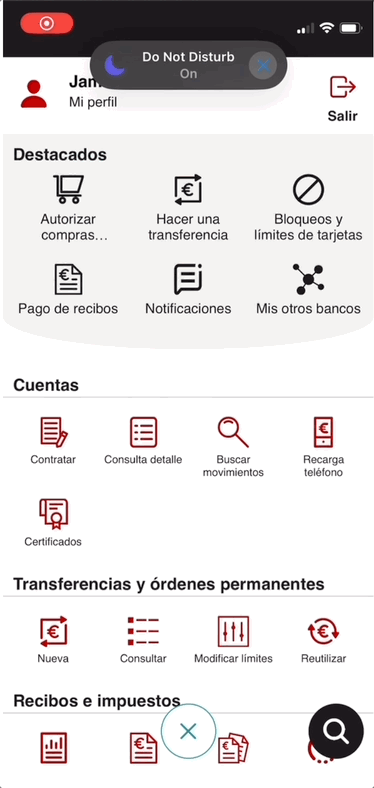
Back to my favourite whipping boy Kutxa Bank. They seem to have accumulated services and functionality over the years like how your mum never throws away old magazines and trinkets. This makes it difficult to find what you’re looking for when you open the main menu.
It’s a brave new UX world
Then, there's the risk-averse culture that plagues the banking industry. Why take risks and try new things when you can just stick with the same old tried-and-true methods? Change is scary, after all.
It's no wonder some banks are lagging behind companies like Wise.com when it comes to UX. Why bother investing in a better user experience when you can just stick with the same old outdated systems and focus on your own needs instead of those of your customers? It's not like customers expect a seamless and easy experience when it comes to their finances, right?
Improving UX design in banking
Here are some high-level UX design strategies for fintech companies:
- Put your customer first and focus on the main functionality they acutely need. What are the 20% of functionalities 80% of your customers use on a daily basis? Can other functionalities be pushed on to the website, rather than cramming them all into your app? What would happen if you didn’t have them at all on the app?
- Test your apps with real users and find out where you’re going wrong.
- Do a competitor analysis of not only other banks but new international fintech companies.
- Streamline your internal processes. Politically this may be a challenge as inevitably some people may feel left out.
- To help streamline your process you can start a new project with a design sprint workshop rather than a massive meeting where nothing gets done. A design sprint workshop can include all the stakeholders in the first few sessions. Then in the later sessions they can have just the key decision makers.
Design sprint workshops are an amazing way to make progress in a short amount of time. You can find out more about them on our Design Sprint overview page.
Conclusion:
Delivering a seamless banking experience is crucial for fintech companies and traditional banks alike. By adopting UX design strategies that prioritise their customers' needs, traditional banks can catch up with fintech companies and remain competitive.
If you’d like to chat about how we might be able to help you improve your digital products feel free to contact our founder James Eccleston.
No comments.