08/08/2023No Comments

What makes a great UX designer?

What sets apart a good UX designer from a truly exceptional one? Beyond pixels and wireframes, great UX designers harness an uncanny power – the ability to connect with a business’ audience, aiding them in achieving their goals as effortlessly as possible.

Throughout my time managing UX designers, I've unearthed several key elements that truly elevate their value within the company:

They can possess the soul of the user

The hallmark of an exceptional UX designer lies in their unique capacity to detach from their own creation and view their interface through the eyes of the mere mortals using their interface. This transformative ability enables them to transcend biases, assumptions, and preconceptions, allowing them to view the interface with fresh eyes. As the designer who created the interface you know where to click and what to read but the user is seeing your design afresh. 

To facilitate detachment from their own perspective, they employ the following four strategies:

1 Analyse how the user's gaze traverses the page

Users exhibit varied scanning patterns. Many begin at the screen's top left corner, descending in an F-shaped trajectory. On other occasions, this pattern might mimic a Z. The dynamics could be intricate, particularly when a person's face graces the page, often becoming the initial focal point for users.

F pattern

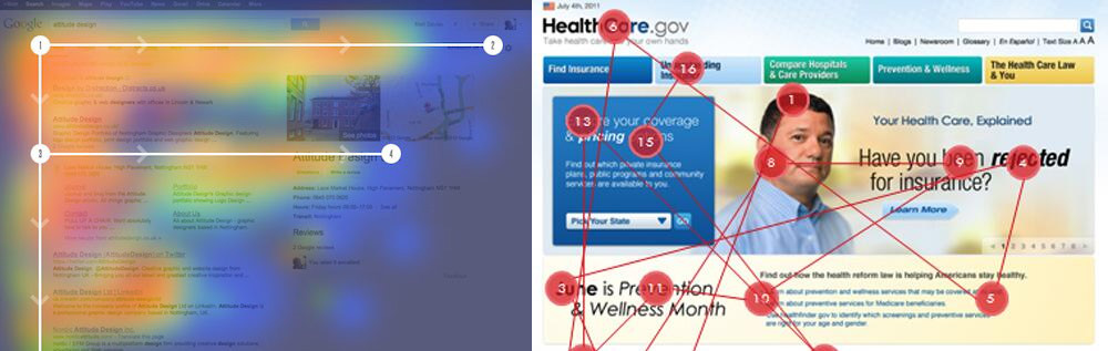
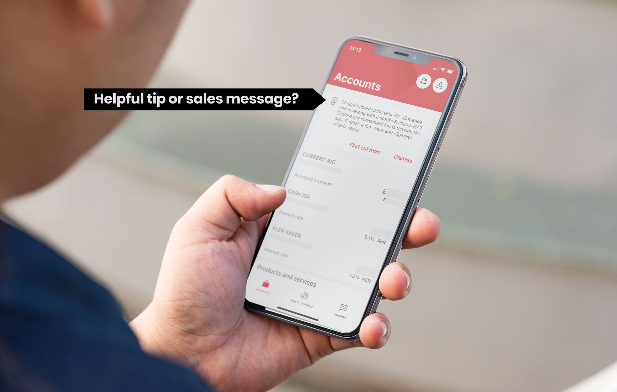
A proficient UX designer strategically positions essential UI elements where users' eyes naturally gravitate. Just last week, a student presented me with a design for an e-commerce website, positioning a product delivery/pickup selector beneath the page's headline. They soon realised that users overlooked it, mistaking it for a banner. Consequently, they relocated it adjacent to the primary call-to-action button, ensuring swift discoverability.

2 Navigate like the user

They meticulously navigate their work step by step, mirroring the user's journey. It's remarkable how fledgling designers might wrap up a user flow and declare, 'Voila, perfection achieved!' Yet, the crème de la crème of UX designers circle back to the flow's inception, probing: 'What's the user's initial click? What unfolds post-click? Does the headline aptly guide the desired user action?' This exercise of walking through flows as users do resembles a mini user-testing session, adept at unveiling a treasure trove of potential pitfalls.

3 Time

Users dedicate mere seconds to a website before rendering judgement on its utility. To seize their rapidly waning attention, conveying your website's value must transpire within a concise 10-second window.

4 Banner blindness

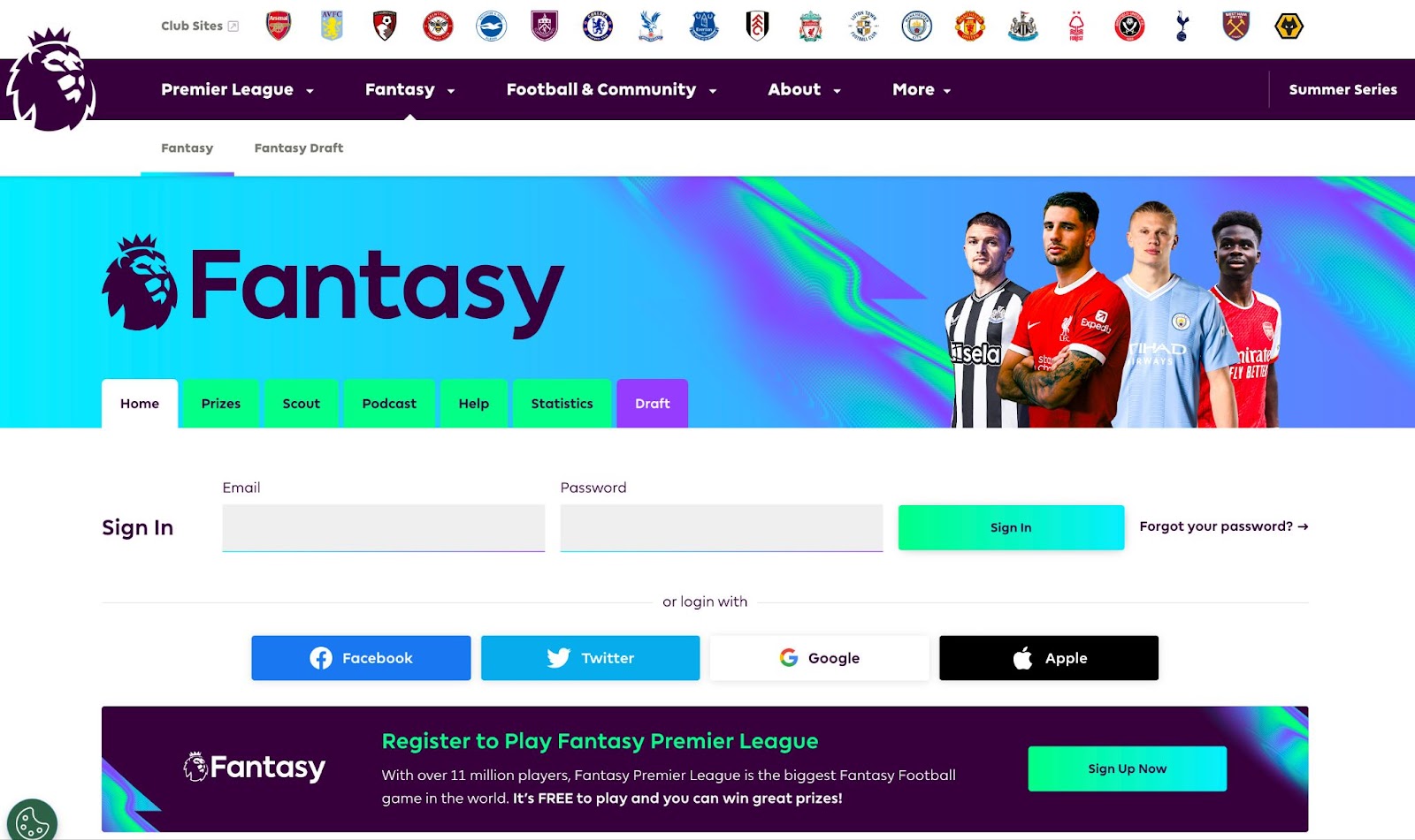
Users tend to skim over anything resembling a banner. Just recently, I overlooked the "Sign Up for Premier League Fantasy Football" prompt, mistaking it for an ad banner. My eyes frantically darted around, scouring typical spots like the top right corner for a good two minutes.

FPL screen shot

They question the almighty (client) 

Challenging the client's perspective stands as a cornerstone of effective UX design. By questioning assumptions, designers unearth the subtleties of user behaviour, refine objectives, and harmonise design with genuine needs. Through adept probing, UX designers forge a path to more authentic, user-centric solutions, enhancing a product's usability and impact.

At times, it's all too simple to follow a client's directives without questioning their underlying rationale. When a request smacks of, 'I saw something cool on another site, let's have it too,' a skilled UX designer dares to probe. A valuable query to pose is, 'What's your goal with this request?' This inquiry peels back layers, unveiling whether the client's proposal aligns with their true intentions.

When a client insists on their design concept, a proficient UX designer complies while also offering an alternate proposal. This dual approach grants the client what they seek while infusing an added layer of insight. I’m often surprised by how often an initially odd-sounding client request actually hits the mark. A capable UX designer sets aside ego, delivering what the client desires, while also bestowing the gift of a second perspective.

Good UX designers try to break their own designs

The finest UX designers exhibit the curiosity of mischievous children who gleefully dismantle their own playthings to decipher their inner workings. Delving into your own design process and contemplating potential pitfalls highlights lurking issues. Consider scenarios like these: What occurs when a user enters an absurdly lengthy name into a form—yes, Salvador Domingo Felipe Jacinto Dalí i Domènech, I'm looking at you. Or when a user inputs an exceptionally short name, G Li, your time has come too. What unfolds when users attempt to send funds they lack? And what transpires when a user stretches the browser window, creating dimensions between mobile and tablet? Such inquisitive minds constantly ponder alternative ways to navigate potential interface snags.

Great UX designers will balance deep work with responding quickly to messages

There are few things worse than sending an urgent request to someone and receiving a metaphorical tumbleweed in response. Navigating the treacherous waters of UX design demands a delicate dance between immersive focus and swift communication. Like a maestro orchestrating a symphony, great UX designers waltz between bouts of deep work, sculpting pixels and pondering flows, and snappy message replies that could put a caffeine-charged squirrel to shame. After all, crafting seamless experiences requires both introspective design solos and nimble duets with clients, ensuring harmony prevails in every interaction. This is especially true in today’s world of remote work where you’re dependent on Slack messages and video calls for a cohesive team.

A lot of top-notch designers swear by 60-minute deep work sprints. During these focused sessions, they disconnect from messages to tackle tasks head-on. Once the sprint's over, they're all ears for urgent requests. But when the work isn't demanding laser focus, they're up for chats and friendly banter on Slack. It's all about striking that balance and being available when it counts.

The best UX designers balance analytical and visual creative skills

They're the maestros who can whip up a drop-dead gorgeous interface that even the Dribbble crowd would turn green for, yet they never let aesthetics compromise functionality. I've witnessed a few UX designers in the past who hid behind their wireframes, hoping a UI designer would magically salvage their half-baked concepts. Personally, I'm not a fan of dividing designers into 'UX wireframe' and 'UI beautification' camps. It's like assigning blame to "Wireframe Johnny" for half the equation. A true star, however, doesn't just design; they prototype their creations. This isn't just about testing functionality – it's a backstage pass into how the grand design symphony should play out, making it a win-win for both design harmony and developer wizardry.

Communication skills are critical for the best UX designers

Nobody's signing up for the "Great Wall of Text" club, especially when three simple bullet points can save the day. This is especially true when managers are overburdened with emails and direct messages. 

When it comes to user testing, nailing communication is non-negotiable. A sharp UX designer crafts tasks that guide users without giving away the answers, while also wielding the power of clever questions to extract those nuggets of gold. Asking the right questions is the secret sauce in user testing sessions.

And hey, let's not forget the unsung heroics of communicating with developers. A little knowledge of CSS, HTML and backend interactions goes a long way. Picture this: you're waiting on the backend to fetch a list of names, but it's taking longer than a sloth on a Sunday stroll. A savvy designer would spice things up with a skeleton loading state or a snazzy spinner. It's all about speaking their language to ensure everyone's in sync.

One of the most important parts of good communication is the ability to listen and stay open to what the user is telling you as well as showing you. Fully concentrating on what a client is saying is vitally important as it will help you create a more worthwhile product rather than just something pretty for your portfolio.

Conclusion: What makes a great UX designer? 

In the dynamic world of UX design, the hallmark of exceptional designers lies in their ability to step into users' shoes, crafting interfaces that transcend personal biases. They strategically position UI elements, navigate through designs as users would, and embrace deep work alongside responsive communication. Balancing analytical acumen with creative finesse, they challenge client assumptions and foster authentic solutions while seamlessly connecting design intentions with user needs.

If you'd like to chat about how we might be able to help your business please feel free to get in touch!

15/04/2023No Comments

Improving UX Design in Banking: Strategies for Catching Up with the Competition

Improving UX Design in Banking is no mean feat. Fintech companies are increasingly setting the bar high for intuitive and frictionless design. In contrast, traditional banks are struggling to keep pace. In this post, we'll discuss why some banks are lagging behind the competition in the UX department and what strategies they can adopt to catch up. Because who needs a smooth and seamless experience when dealing with something as important as your money, right?

Why some traditional banks lag behind in UX design:

Due to ‘if ain't broke, don’t fix it culture’, established banks are just fantastic at providing a bad user experience. Who doesn't love clunky, outdated systems that require specialist skills and long lead times to make even the simplest changes? And let's not forget the joy of navigating multiple channels and systems just to complete a single transaction or access account information. It's like a fun little game of digital hopscotch!

Marketing departments getting their mucky fingers in the UX design pie

Traditional banks tend to have marketing departments that wield way too much power for their own good. I'm looking at you Jane, VP of ‘I have to make changes to a design of an app to justify my job to my boss’ at Le Gacy Bank. 

Marketing departments can cause banking apps to have worse UX by prioritising their own goals over the needs and expectations of customers. When marketing becomes the driving force behind a design it can lead to features that are more focused on promoting ‘special offers’ than providing a seamless and intuitive user experience.

The Spanish bank Kutxa is a frequent offender of marketing getting in the way of a good user experience. Upon logging into the app, a marketing message is presented, but let's be honest, 99% of the time, it's completely irrelevant and uninteresting to you. Thanks Jane. 

Kutxa marketing message when you open their app. This is not improving UX Design in Banking.

Marketing departments may also insist on adding flashy graphics to the app that serve no real purpose other than to promote the brand or an offer to upsell to the customer. These elements can slow down the app's performance or make it more difficult for users to navigate, leading to a poor user experience. This can be especially frustrating for customers who are trying to complete a transaction or access important account information.

HSBC actually has a very usable banking app but sneaky John from the Business Growth and Marketing department has still managed to disguise a sales message as a helpful tip. Ok, I might be being a bit harsh here, perhaps you really do want to know about their ISAs but generally when I log on to my banking app I want to check my balance or make a transaction. If I did want an ISA I would search for it in the menu. Call me old fashioned but I like my tools to do a job and not sell me things. 

The HSBC app sneaks in a sales message. This is not improving UX Design in Banking.

Bloated apps that are not improving UX design in banking

Some apps have become bloated due to legacy banks trying to offer too many services. This can be seen in apps that offer a wide range of features that aren't necessarily relevant to their customers, such as investment services or insurance options that customers may not be interested in.

Some legacy banks have tried to integrate investment and trading services into their banking apps to compete with fintech startups that specialise in these areas. However, this can lead to a cluttered user interface and a confusing user experience, especially for customers who are primarily interested in basic banking services like checking and savings accounts.

Moreover, some banking apps have attempted to offer too many ancillary services, such as travel booking or restaurant reservations, that may not be essential to their core business. This approach can lead to a lack of focus and a dilution of the bank's brand identity, as customers may view the bank as trying to do too many things at once. Improving UX design in banking is not only about creating a visually appealing design but thinking about what services you want to offer.

In contrast, digital-only banks and fintech startups have taken a more focused approach, offering a limited number of core services that are designed to meet the specific needs of their target audience. For example, some digital banks focus solely on providing mobile banking services, while others specialise in personal finance management or small business banking. This approach can lead to a more streamlined and intuitive user experience that is better suited to the needs and expectations of customers.

Back to my favourite whipping boy Kutxa Bank. They seem to have accumulated services and functionality over the years like how your mum never throws away old magazines and trinkets. This makes it difficult to find what you’re looking for when you open the main menu. 

It’s a brave new UX world

Then, there's the risk-averse culture that plagues the banking industry. Why take risks and try new things when you can just stick with the same old tried-and-true methods? Change is scary, after all.

It's no wonder some banks are lagging behind companies like Wise.com when it comes to UX. Why bother investing in a better user experience when you can just stick with the same old outdated systems and focus on your own needs instead of those of your customers? It's not like customers expect a seamless and easy experience when it comes to their finances, right?

Improving UX design in banking

Here are some high-level UX design strategies for fintech companies:

  1. Put your customer first and focus on the main functionality they acutely need. What are the 20% of functionalities 80% of your customers use on a daily basis? Can other functionalities be pushed on to the website, rather than cramming them all into your app? What would happen if you didn’t have them at all on the app? 
  2. Test your apps with real users and find out where you’re going wrong.
  3. Do a competitor analysis of not only other banks but new international fintech companies.
  4. Streamline your internal processes. Politically this may be a challenge as inevitably some people may feel left out.
  5. To help streamline your process you can start a new project with a design sprint workshop rather than a massive meeting where nothing gets done. A design sprint workshop can include all the stakeholders in the first few sessions. Then in the later sessions they can have just the key decision makers. 

Design sprint workshops are an amazing way to make progress in a short amount of time. You can find out more about them on our Design Sprint overview page. 

Conclusion:

Delivering a seamless banking experience is crucial for fintech companies and traditional banks alike. By adopting UX design strategies that prioritise their customers' needs, traditional banks can catch up with fintech companies and remain competitive.

If you’d like to chat about how we might be able to help you improve your digital products feel free to contact our founder James Eccleston

07/03/2023No Comments

Why Touch Screens Aren’t Always the Best Choice: A Closer Look at the UX of Touch Screens vs. Real Buttons

Are touch screens really the answer for all modern electronic devices? As a UX agency, we've seen a growing trend of touch screens being used in all sorts of devices, from ovens to cars. Want to make an oven look cool and modern, stick a touch screen on it Mr Zanussi. Designing a new fridge Mr Smeg? It won’t be one of the cool kids without a touchscreen. Creating a new electric car, you guessed it, Elon, stick a massive iPad in there. While they may seem like the obvious choice for modernisation, they come with their own set of UX challenges.

UX is better when it’s touchy feely

One major issue with touch screens is the lack of tactile feedback. Users rely on their sense of touch to navigate through physical buttons, but touch screens require visual feedback. Touch screens crave attention when our eyeballs have more important jobs to be doing. Sure, using touch screens might be a bit more dangerous while driving, but who needs to pay attention to the road anyway? And what's a little frustration and confusion when navigating through menus and sub-menus? It's not like we have anything better to do with our time.

Durability is another concern with touch screens. While physical buttons can withstand wear and tear, touch screens, like the ego of most influences, can easily shatter at the slightest bump. This can be a costly repair for users, and it raises questions about the longevity of electronic devices with touch screens, becuase you hate the environment and have unlimited money, right?

Functionality is also a consideration when it comes to touch screens. Multiple functions assigned to each button can be easily accessed, but touch screens require users to navigate through menus and sub-menus. This can be time-consuming and confusing, especially for users who are not tech-savvy.

Some of the best user experiences for electric devices mix both touch screens and physical buttons such as Canon and Sony cameras. The important buttons are physical buttons that are easy to reach while their touch screens handle less time sensitive actions that require more attention. Check out this review on the best camera menus. Sony have physical buttons you can customise to perform a chosen function.

The Sony A7 uses custom buttons for a better UX or user experience
The C buttons can be programmed with a chosen functionality

Remember the epic UX fail of the Apple Touch Bar?

Remember the Apple Touch Bar? Sure, it looked like a fancy strip of glass, but let's be real here - it was about as useful as a chocolate teapot. For most users, it was more of a hindrance than a help. Because who needs intuitive and reliable function keys when you can have a thin strip of unresponsive glass plastic that requires you to take your eyes off the screen just to skip a song?

And let's not forget the sheer joy of having to switch menus and tap your little heart out just to perform basic tasks. Who needs efficiency when you can have a touch bar that slows you down at every turn?

Touch screens secretly hate the visually impaired

Visual feedback is an issue with touch screens, as they rely heavily on users being able to see the screen clearly. This can be problematic for users with visual impairments as they benefit much more from being able to feel a physical button and gauge feedback through their fingers rather than an often subtle change in light or colour. Efforts have been made to give touch screens haptic feedback but this can’t replace that smooth feeling you had while turning up the volume on your dad’s, ‘this-is-too-expensive-for-you-to-touch’ hi-fi in the 80s and 90s.

Better UX with an 80s system with real buttons
Dad spent a lot of money on this so don't you dare break it.

While touch screens do have their advantages, such as being more intuitive for certain tasks like scrolling or zooming, they are not always the best choice. It's important to consider the context in which they're being used and whether physical buttons may still be the superior choice.

A UX agency's point of view

As a UX agency, we recommend considering all options before choosing touch screens for your product. Physical buttons may still be the better choice in certain contexts, and they can provide a more intuitive and reliable user experience. So next time you're designing a new interface, don't dismiss the humble button. It may just be the better option after all.

If you need help designing your next interface feel free to contact us and we can arrange a call.

Written by: James Eccleston - Founder and Creative Director

03/01/2023No Comments

Avoid these fintech UX mistakes

I thought it would be a good idea to start the year off on a negative note. There have been a ton of negative things that have happened over the past few years but the world of fintech and UX seems to have escaped, if you discount all that crypto malarkey. Therefore in the interest of equality I’d like to redress the balance by pointing out some of the UX mistakes made by fintechs.

Arse covering disclaimer part 

Often there are very good reasons for these so-called UX “mistakes”. Mistakes are a vital part of success and progress, I’ve made a fair few in my career. One cost a multinational £30,000 but hey, that multinational went on to sue the NHS, so I don’t have any guilt there. This post isn’t meant to have a dig at the designers of these apps, as we all know, some decisions are beyond their control.

Some common fintech UX cock-ups  

Lack of clarity and simplicity

One of the most common UX mistakes made by fintechs is making their products or services too complex for the average user to understand. Financial products can often be difficult to understand for the average person, so it's important for fintechs to clearly explain their offerings and make it easy for users to navigate their platforms. This can be achieved through the use of clear and concise language, as well as intuitive design elements that guide the user through the process.

One example of a lack of clarity is the Assets page on Coinbase, which is otherwise an excellent app! When viewing your balance it’s not clear if your balance increased because you added credit to it or if the market has risen. It would also be a nice touch to see when you added credit to your account on the graph somehow. Perhaps there is a history section somewhere but it was too taxing for my 3 second attention span brain to find.

Poor onboarding experience

Onboarding is the process of introducing new users to a product or service, and it's crucial for fintechs to get it right. If the onboarding experience is confusing or frustrating, it can lead to a high churn rate (the percentage of users who stop using a product or service). Fintechs should aim to make the onboarding process as smooth and seamless as possible, with clear instructions and guidance to help users get started.


I’ve often struggled with Binance and binned the app a while ago. I downloaded it again, for the purpose of this post, and I instantly hit a roadblock. You come to a point where you have to confirm you’ve read the T&Cs and it's not obvious how you do that. You have to tap the small grey circles to the left but they don’t look clickable. They are also smaller than most fingers and thumbs. This problem could have been identified with some basic user testing.

Inadequate security and privacy measures

In the financial industry, security and privacy are of utmost importance. Fintechs that fail to properly protect their users' sensitive information can suffer serious consequences, both for their finances and reputation. It's essential for fintechs to implement robust security measures, such as encrypted data transmission and multi-factor authentication, to protect their users' information. Additionally, fintechs should be transparent about their privacy policies and clearly communicate how they handle user data.

A vulnerability in the Equifax website was left unresolved due to failures in Equifax’s internal processes. Equifax also failed to renew an encryption certificate on one of their security tools. This allowed hackers to extract data in encrypted form for months. This lead to the theft of 143 million US accounts, 200,000 credit card numbers. #ThanksEquifax

Adding too much functionality 

Adding too much functionality in an app can lead to confusion and a cluttered user interface. It can also increase the learning curve for new users and make the app more difficult to navigate. It is important to focus on providing a clear and streamlined experience for the user, rather than overwhelming them with unnecessary features. There are only rare occasions when a digital product that does just about everything actually works. Facebook’s Marketplace has had some limited success and super apps like WeChat in China are popular but there are specific reasons for that. In most EU and North American countries an app that does everything would make for a pretty poor fintech UX.

You secretly hate users with disabilities

Fintechs should also ensure that their products and services are accessible to users with disabilities, such as visual impairments or mobility impairments. This includes providing options such as screen readers, large font sizes, and easy-to-use controls for users with visual impairments, as well as making sure that the platform is easy to navigate for users with mobility impairments. Having said that, it is a challenge to make the app visually appealing and meet accessibility guidelines. At times it feels like the only accessible colours are black, white and blue. Here you can see how Binance would fail an accessibility check on the colour contrast and size of the typography. It looks great but f-you if you have low visibility. 

Fintechs have the potential to revolutionise the way we manage our finances and make it easier for everyone to access financial services. However, it's important for these companies to avoid common UX mistakes and prioritise the needs and satisfaction of their users. By focusing on clarity, simplicity, onboarding, security and privacy, mobile optimisation, and accessibility, fintechs can create a positive and seamless experience for their users.

Other fintech UX sins

It's important to note that every product or service will have its own unique set of challenges and opportunities when it comes to user experience design. However, here are a few more examples of fintech apps that have sinned in the face of the UX gods:

Robinhood

Robinhood is a popular stock trading app that has faced criticism for its complex and confusing user interface. Some users have reported difficulty navigating the app and understanding certain features, which can be frustrating and lead to a negative experience. Additionally, the app has faced controversy over its gamification of stock trading, which some critics argue can encourage risky behaviour. 

Venmo

Venmo is a popular peer-to-peer payment app that allows users to easily send and receive money. However, the app has faced criticism for its confusing navigation and the fact that it's often cluttered with too much information. Some users have also reported difficulty understanding certain features and the fees associated with using the app.

Cash App

Cash App is another popular peer-to-peer payment app that has faced criticism for its confusing user interface. Some users have reported difficulty understanding certain features and navigating the app, leading to a frustrating experience. Additionally, the app has faced controversy over its security and privacy practices, with some users reporting unauthorized transactions on their accounts.

Again, it's important to note that these are just a few examples, and it's not uncommon for products and services to face challenges or criticisms when it comes to UX. The key is for fintechs to continuously listen to feedback from their users and strive to improve the user experience of their products and services.

How to correct fintech UX mistakes

One way to correct these mistakes is with a UX heuristic evaluation. This is basically an evaluation by a UX designer experienced in spotting mistakes by using a set of guiding principles. It’s extremely useful to have an outside set of eyes look over your app or website. It’s often the case that your in-house team would have been working so closely on the design that they find it hard to spot errors a fresh pair of eyes would.  Here at Bridge Studio we’ve developed our heuristic evaluation guide. If you think you’d benefit from an heuristic UX evaluation feel free to contact us for a free consultation call

25/12/2022No Comments

Fintech apps: how to resolve the most common problems

Fintech apps have become an increasingly popular way for people to manage their finances, pay bills, make investments, and more. These apps offer convenience and accessibility, making it easier for people to stay on top of their financial affairs. However, as with any new technology, there are bound to be a few problems. Here are some of the main problems fintech apps have, and how they are working to resolve them. It's a very high-level overview but please feel free to contact us if you'd like to know more about how we could help you solve any problems you have with your product.

Security concerns with fintech apps

One of the main problems fintechs have is security. With so much personal and financial information being stored on these apps, it's important that they are secure to prevent hacking and data breaches. Fintech apps address this issue by using advanced encryption techniques and regularly updating their security protocols. They also often have secure login processes, such as biometric authentication or two-factor authentication, to ensure that only the rightful owner can access their account.

Limited access to certain financial products

Another problem with fintechs is that they may not offer access to all financial products. For example, some apps may only allow users to make investments in certain stocks or mutual funds. This can be frustrating for users who want to diversify their portfolio or invest in other types of assets. Fintech apps can address this issue by expanding their offerings and partnering with financial institutions to offer a wider range of products.

Complexity

Fintechs can sometimes be complex, especially for those who are not familiar with financial concepts or technology. This can make it difficult for users to understand how to use the app and make informed financial decisions. To address this issue, many fintech apps offer educational resources, such as blogs and tutorials, to help users understand how the app works and how to make the most of it. These resources can be particularly helpful for those who are new to investing or managing their finances, as they can provide a foundation of knowledge that can help users make informed decisions.

Lack of personalisation

Fintech apps can also lack personalisation, as they may not take into account an individual's unique financial situation or goals. This can lead to generic recommendations or financial planning that may not be tailored to the user's specific needs. To address this issue, some fintech apps offer personalised recommendations or financial planning services to help users achieve their financial goals. These services can be particularly useful for those who are unsure of how to reach their financial goals or who need guidance on how to get there.

Poor UX design in fintech apps

In addition to the above issues, fintech apps can sometimes have poor user experience (UX) design. This can make the app difficult to navigate and frustrating to use, which can turn users off. To address this issue, fintech apps are investing in UX design to make their apps more user-friendly and intuitive. This includes things like clear and concise menus, easy-to-use buttons and functions, and visually appealing graphics and layouts. A well-designed app can make all the difference in terms of user satisfaction and engagement.

Customer service

Another issue that fintechs can face is a lack of effective customer service. This can be particularly problematic when users have questions or issues with their accounts or transactions. To address this issue, many fintech apps offer customer service through various channels, such as phone, email, or live chat. Some even offer 24/7 support to ensure that users can get the help they need whenever they need it.

Lack of trust in fintech apps

Finally, some people may be hesitant to use fintech apps due to a lack of trust. This can be especially true for those who are new to using digital financial tools or who have had negative experiences with other financial products in the past. To address this issue, fintech apps can work to build trust by being transparent about their business practices, offering strong security measures, and providing excellent customer support. They can also partner with reputable financial institutions and earn industry certifications to demonstrate their commitment to professionalism and customer satisfaction. By building trust with users, fintech apps can help alleviate any concerns and make it easier for people to feel comfortable using their services.

Do you need help designing a fintech app?

Bridge Studio would love to help you create your next app or financial product. Feel free to contact our team to arrange a chat.

Contact us

21/12/2022No Comments

What are super apps and will they take over?

Just when you think you’ve got things figured out, like how apps should be super specific and do one job very well, something comes along and does a giant poo on that idea. Right now super apps are excreting vast amounts of faeces on that very idea.

A super app is a mobile application that offers a wide range of services and features. They typically encompassing multiple categories such as e-commerce, transportation, food delivery, entertainment, and more. In contrast, a normal app is a mobile application that is focused on a specific function or purpose, such as a social media platform, a gaming app, or a weather forecasting app.

Super apps are popular in Asia, particularly in countries such as Indonesia, China, and India.

There are several key differences between super apps and normal apps that are worth considering

  1. Range of services: As mentioned, they offer a wide range of services and features within a single app, while normal apps are typically focused on a specific function or purpose. This means that users of these apps can access a variety of services without having to download and switch between multiple apps, making them more convenient to use.
  2. User experience: They often offer a more streamlined and integrated user experience, as all of the services and features are accessed through a single app. Normal apps, on the other hand, may require users to switch between different apps or use multiple apps to access different services.
  3. Monetisation: Both super apps and normal apps can be monetised in various ways, such as through in-app purchases, subscriptions, or advertising. However, super apps may have more opportunities for monetization due to the wider range of services they offer.
  4. User data: They often collect and process a large amount of user data due to the wide range of services they offer. This can raise concerns about privacy and data security as the app has access to a large amount of sensitive information about the user. Normal apps typically collect and process data related to a specific function or purpose, which may be less sensitive.

Overall, these all in one apps offer a wide range of services and can be convenient for users and provide opportunities for monetisation. However, they also raise concerns about privacy and data security due to the large amount of user data they collect and process. Normal apps, on the other hand, are typically focused on a specific function or purpose and may collect and process less sensitive data.

Leading super apps

  1. WeChat: This super app is a messaging and social media platform that also includes features such as payment options, booking services, and gaming.
  2. Gojek: This super app is a ride-sharing service that also offers food delivery, groceries, and other services such as beauty appointments and home cleaning.
  3. Grab: Similar to Gojek, Grab is a ride-sharing service that also offers food delivery, groceries, and other services such as home cleaning and payment options.
Image from the WeChat blog

There are a few reasons why super apps have not gained widespread popularity in the USA and Europe. The USA and Europe already have a high number of apps available for download, making it difficult for a new super app to stand out amongst highly specialised apps. Also people in the USA and Europe are used to using specific apps for specific tasks, rather than using a single app for everything. This means that a super app may not be as convenient or useful for users.

Overall, the success of super apps in the USA and Europe may depend on the ability of the app to differentiate itself from existing competitors and address user concerns about privacy.

Africa might be the new high growth area for all in one apps

It is likely that super apps will continue to grow in popularity in Africa as they offer a convenient and integrated platform for various services. As mobile technology and internet access improves in the region, more and more people will likely turn to super apps for their daily needs.

With the rise of e-commerce and digital payments in Africa, super apps that offer these services will likely see even more growth. As businesses continue to adapt to the digital age, super apps will become increasingly important for both consumers and businesses in Africa.

The future of super apps in Africa looks bright as they offer a convenient and integrated solution for various needs and are well-suited for the mobile-first culture of the region.

Will super apps take off in the US and Europe?

It’s difficult to predict with certainty whether super apps will take off in the USA and Europe. There are several factors that could influence their adoption, including the willingness of consumers to use a single app for multiple services, the ability of companies to offer a wide range of services within the app, and the availability of similar competing apps. Additionally, cultural differences and consumer preferences may impact the success of super apps in these regions.

If they do take off they might appear by a fintech app adding other services and slowly growing rather than a new app coming on the scene and dominating. I feel that it would be difficult for a jack of all trades app to break into a market dominated by specialists. Any super app would have to offer a substantial increase in user experience and reduced friction compared to switching apps on a modern smartphone.

Another big question is do users in Europe and USA need to have everything combined in one app? Do you really want to buy cleaning materials and then book a cab all at the same time, unless you’re just murdered someone? I could be wrong, after all, I thought that self-driving cars would totally go mainstream and be useful in the near future but now it looks like they are quite a few years away. Sorry Kit, you’ll just have to wait. 

So are super apps just about to take over the US and Europe, probably not.  Let’s see if time does a massive poo on this post and proves me wrong. 

If you'd like to talk about developing an app please feel free to send us a message.

14/09/2022No Comments

How to spot & hire amazing fintech developers

Hiring a bad fintech developer is like dating someone who appears amazing and then the moment you decide to commit they become an abusive alcoholic, put on 20kg and start treating you like rubbish. Having a rotten apple in the team is a huge liability.

A current Bridge Studio client recently asked for consulting advice on how to hire fantastic developers that get the job done while not smelling of cheese. So let’s unpack how we’ve created our amazing development team and the process we took.

We can break it down into 4 phases:

  1. Set the criteria
  2. Searching
  3. Interviewing
  4. Testing

Setting the criteria for hiring amazing fintech developers

Through painful trial and error we’ve found that candidates with the right cultural fit and enthusiasm to learn do better than candidates that have the right technical knowledge and experience but don’t fit with our culture. As long as they have a desire to grow and be open to learn, the rest can be taught. 

In his book, Delivering Happiness, Tony Hsieh wrote that you should hire and fire on your brand values. Finding people who understand your company’s core values is key to building a thriving business. So if your brand values are all about warmth and openness you should look for people who show these values through their actions and communication. However, not everything is so black and white. For example, some people may be shy and introverted, so it’s important to identify that in order to ask the right questions to gauge what type of person they are.

It goes without saying that you should always be looking for candidates that show enthusiasm, openness to learn, humbleness, empathy and honesty. 

Searching for fintech frontend developers

It’s safe to say that for each job role we evaluate over a 100 CVs. This generally gives us about 4 candidates that are good enough to interview. Our hunting ground is usually Linkedin where we post free and paid ads, other tech job sites, as well as asking our current team and friends for referrals. Each country may have their own  particular jobsite or freelancer. In Spain, for example, we’ve used Malt. Once we have over 100 CVs, we filter them into 3 folders: 

No f-ing wayMaybeHell yeah
Our selection processs


Important tip:

Both a designer and another frontend developer should be reviewing the CVs and portfolios. 

Ignore their CV

Well, maybe you can ignore 90% of it. At most, it serves as a VERY rough guide to their background, areas of expertise and claimed years of experience. 

It’s far more important to analyse their work and portfolio while asking the following questions:

  • Does their work look like it’s using a template and they’ve just changed the colours? 
  • Is their work for real companies or is it made-up projects for their portfolio?
  • Have they applied hover states to the clickable items?
  • How does it degrade when you make the browser smaller?
  • Does it load quickly? 
  • Is their code clean?
  • Is it designed well or does it look like the original design was good but the programmer has murdered it? 

Even though you’re looking for a programmer, it’s extremely important that they have a good eye for design as they will be translating a layout from a designer. It’s hard to reproduce something in code that you don’t understand. 

Interviewing a programmer
We're still trying to get the hang of producing illustrations using Midjourney

Interviewing a frontend developer

The objective of the interview should be to find out 

  1.  If they are a good fit for your team and if they have a strong work ethic
  2.  If they have sufficient technical knowledge to do the job
  3. To explain the job and sell it to them

An interview isn’t only for you to choose someone but for them to choose you. It’s a two way deal. 

To pick out the best candidates, you need to be good at reading people to gage if they will compliment your team. We find that a semi-structured conversational approach works well. That way we have space to deviate and ask any questions that come to mind. You should alway ask questions that are specific to your needs but here is  a sample of the questions we ask during our interviews:

  • Can you run me through your process when you receive a brief?
  • What’s the difference between visibility hidden and display none? 
  • Tell me about how you work with UX designers to ensure the coded site best represents their original vision. 
  • Tell me the difference between div and span.
  • What’s the most frustrating thing about working with a designer?
  • How do you organise your work?
  • Do you prefer to work alone or in a team?
  • What is yourr passion outside of work?
  • How do you handle disagreements with other team members?
  • Why did you become a programmer?
  • What areas of your career would you like to progress?
  • What was the last meme you laughed at?
  • What questions do you have for us?

We find that developers that do well in a fintech environment are good at handling tables with large amounts of data, have the knowledge to speak to backend developers and understand that their work will be heavily database driven. 

Testing a frontend developer

Once we have identified candidates that we feel are a good  fit for our team,  we send them  a test. We pick a design that we’ve produced recently that is a good representation of the work they will be doing. then we give them a deadline to complete it. This gives us an understanding of how they work in a slightly more pressured environment. 

Once we receive their coded pages, we then assess them for how well it represents the original design, how clean the code is, and if they have added any extra touches that were not asked for. The best candidates always go the extra mile and add some special touches such as a transition animation. 

Failure to complete the task in the given time is a major red flag. 

We use a simple Google Sheet table to give the candidates scores (1-10) for their code, ability to reproduce the design, interview and general vibe they gave off. We use this as a guide on who we should hire. The final decision is made by the founder of Bridge Studio along with input from their lead developer and UX designer. 

how we rate our devs
Our rating system

This process isn’t perfect and is constantly evolving.  We do make mistakes, but so far it has served us well. We try to keep it a mix of art and science, somewhere between a gut feeling and a clinical decision. I’ve found that my gut has got larger with age but also better at making decisions. 

Key takeaways for spotting & hiring amazing fintech developers

  • Hire and fire on brand values and attitude
  • Look at 100s of CVs
  • Their work is more important than their CV
  • Make candidates do a test to see how well they will perform in context

What we hate:

  • Devs with no portfolio (or just a link to github with no live sites)
  • Replying slowly to emails or bad communication 
  • Lying about their work

Want to know more about Bridge Studio? Feel free to contact us

28/01/2022No Comments

Building a Brand? Read This Before Contracting a Branding Agency

How to avoid the boasters, the ‘yes-men’, the fake case studies, and the click-baiters…and instead find the deeper thinkers, the probers, and those who execute on ideas…

Okay, this title may be a little click-baitey but….you really should read this before contacting a branding agency.

They say it takes ten thousand hours to master a skill.

But who has ten thousand spare hours lying around when you’re trying to build a successful business?

The answer is no-one. If you do, then you’ve either discovered time travel (free tip: this is probably more profitable than what you’re doing currently) or your business isn’t getting off the ground.

The modern start-up

In this day and age, the one-man-band start-up is becoming an ever more attractive (and ever more possible) method of founding a business. It’s possible to start, run, and grow a business from your laptop or mobile phone. Business can be fully automated, and branding is only one of many things that the modern entrepreneur can now do alone.

A typical start up founder Contracting a Branding Agency
A typical start-up founder.

How well it can be done is another matter. As businesses grow – which, for those in rapidly expanding sectors such as renewable energy or fintech – they also need to expand. Whether this is in terms of staffing, investment, or accessing new markets, the greatest businesses are ultimately those that are able to carry on growing.

Inevitably, this means that the workload often becomes too onerous for a small team lacking specialism in certain areas. It is in specialist areas such as branding that contracting a branding agency begins to become attractive.

The stereotype of the agency signals welcome relief for some, grand opportunities for others, and for the doubting Thomases, a big red flag with an even bigger red cross on it.

Boris shovelling food down his troff. He won't be Contracting a Branding Agency
Feeding time at No.10

The problem is, it can be difficult to work out which agencies are design and strategy by blood, and which are going to send your brand reputation crashing and burning faster than the cheese and wine slid down the Prime Minister’s gullet. When you’re building a business, strong branding is imperative.

However, its true value is still perhaps misunderstood amongst businesspeople who can be deterred by added costs and a dilution of decision-making power. Ironically, the very thing that would sway the sceptical project managers and owners when it comes to contacting a branding agency is trust – exactly what branding is meant to create.

So, what exactly should you know before contracting a branding agency?

There are several ways to weed out the good’uns from the bad’uns when it comes to contracting a branding agency. Telling signs will exist from the very first interaction to the delivery of the final project.

So what should you look out for? What are some of the most common mistakes companies make when contacting a branding agency? And what should a visionary branding agency give to your growing business?

Here is the truth told, from the heart of a branding agency itself.

What now when you want to Contracting a Branding Agency
Example of a poker face

1. Don’t shy away from a branding agency that asks you probing questions

Imagine going to the doctors and leaving as soon as they asked you “what seems to be the problem?”. You’d not only be wasting their time, your own time, and everyone else’s time, but you wouldn’t actually get a solution to the problem you were experiencing. To diagnose, the doctor has to understand what’s wrong.

A similar principle can be applied to contacting a branding agency. Sometimes, companies can be deterred by agencies who allegedly ask ‘too many questions’. And, to an extent, that’s understandable given that you ultimately pay for somebody else to do the work for you.

Deep in a fake conversation for the photo. This branding agency has contracted a great photographer.
Deep in a fake conversation for the photo

But this approach is weaker than a hamster who’s just gone twelve rounds with Tyson Fury. Whilst an agency is there to do the work for you, branding is a particularly personal process that, to receive the best results, needs the most collaboration. You don’t need to hold the agency’s hand every step of the way, but you do need to face up to the probing questions that the agency will want to ask you.

By understanding what lies behind the facts and figures, a branding agency will be able to create a bespoke final identity that acts as a sale-spinning pivot between you and your target consumer. You’ll also simultaneously learn more about your own offering and how to improve it.

To create personal connections, it’s important to answer the questions that get to the heart of any brand: the people. 

ME me branding when contracting an agency

2. Accidentally contracting a branding agency that’s all ‘me, me, me’

A website littered with glittering awards and superb testimonials…

An office with lined walls of CEO and super client ‘partner outreach’ photos, all of which involve a copious amount of alcohol on the desk in front.

A staff culture that screams ‘work hard, play harder’.

In theory, there’s nothing wrong with this. After all, who wouldn’t love to partner with an agency with a vibrant staff culture whose work is clearly of a good quality. But what about when things become less Richard Branson and a little more David Brent?

When contacting a branding agency, it’s important that their outlook is entirely consumer-first. Of course, it’s a good idea to share achievements and awards to build credibility, and branding should always be seen as a discipline of business that revolves around the concept of togetherness.

However, when an agency is all ‘me, me, me’, things can get difficult. It’s important to look for honest customer reviews and join a brand workshop to see whether the agency in question is willing to help shape your vision for your company, first and foremost.

Great branding results come when experts in design use their expertise to shape another organisation’s vision and portray this value to the consumer, not when the experts decide to reimagine their client’s entire outlook. Honesty and empathy are key virtues to look for when contacting a branding agency. Don’t compromise on them.

A fake branding mockup used to contract an agency

3. Beware of fake studies

It’s not always good to be pessimistic, but when you’re contacting a branding agency, the criteria should be stringent. Naturally, entrusting an independent team to bring your business to life off-paper carries a degree of risk as you simply aren’t in control.

Fear not. Any credible branding agency will be composed of lateral thinkers with the ability to engage with tomorrow’s visions from innovative renewable energy or forward-thinking fintech, to large NGOs seeking a transparent and hard-hitting identity.

The problem is, not all branding agencies are so successful. Not all hit the sweet spot. Some just lie. Yeah…really.

The fake case study is all four horsemen of the apocalypse when it comes to contacting a branding agency. But how do you spot fake case studies? Look out for:

  • Outlandish claims and even more outlandish figures – no, BS Marketing did not experience a 700% increase in lead conversions with their new website.
  • A poorly proofread final copy – no credible case study will mix up ‘their’, ‘there’ and ‘they’re’.  
  • No links back to the business whose branding they worked on – in 2022, the phantom company isn’t ‘underground’ or ‘moving quietly. It simply doesn’t exist.
a yes man Contracting a Branding Agency
You know this guy says yes to most things he shouldn't

4. Steer clear of ‘yes men’ when contracting a branding agency

We’ve already said that it’s not good to work with a branding agency that places themselves at the centre of your project. However, the proverbial ‘yes men’ can also create problems within the branding process.

Any creative discipline requires a collaborative approach. Bouncing different ideas on them – and challenging these ideas to form better ones – is a crucial part of the branding process. As they say, the first idea that comes to mind isn’t always the best.

However, if your branding agency goes along with your each and every request despite them being the experts, you may as well do it yourself. A good branding agency will help shape and guide your vision, keeping your core values and thoughts at the heart of the process, but ultimately combine their experience and skills with your outlook.

When contacting a branding agency, remember: a yes is good…but only for good ideas.

Elastica band from the 90s Contracting a Branding Agency
Bonus points for anyone who gets this reference

5. Connection with the branding agency is the most important thing

Branding is all about connections. Connections between customer and brand, between brands and other brands, and even between the people that make up these brands.

Branding creates customer loyalty, and this loyalty is earned through the subconscious relationships that are forged between a customer’s values and the complimentary values that an organisation’s branding portrays. This can come through the colours used on the logo, the copy used on the website, and even the experience a customer has in store.

Social media from Bridge Studio
Social media design

So, if branding is all about connecting values and visions, you and your branding agency need to be on the same page. We’re not suggesting that you need to embark upon a complimentary Christmas card exchange each year, nor that you need to offer the creative director the chance to be your middle child’s godfather.

However, it is vital that a healthy channel of communication and a clear willingness of the agency to put your business and its intended identity first exists.

Cheap prices at a cafe
You get what you pay for. Photo: Brett Jordan

6. You get what you pay for

Everyone likes a bargain, but nobody likes bad quality. The problem is, the former often leads to the latter. Aldi and Lidl have some excellent products at a great price, but the Queen will probably continue to shop at Fortnum and Mason’s.

 A similar principle applies to contacting a branding agency. Sure, nobody likes to be ripped off, and some agencies do take liberties with their pricing. However, branding is an intricate art that requires a diverse skill set and knowledge base spanning an intimate understanding of UI/UX, user psychology, website coding, complex digital creative tools, and much more.

As a rule of thumb, the best agencies will charge more, and deliver results. That’s not to say that cheaper agencies won’t, and there’s nothing wrong with charging a little less. However, when the pricing looks suspiciously low, it’s probably a good idea to go with your gut. Buy cheap, buy twice.

A town called Answers
Photo: Hadija Saidi

7. Before contracting a branding agency, ask the right questions

So, you’ve managed to narrow down your options and have weeded out the yes men, the fakers, and those whose ego makes Zlatan Ibrahimovic look humble. You’re about to send off the email to kickstart your branding journey. What should you ask about?

  • Whether they have previous experience working with businesses like yours
  • Case studies, if not publicly available
  • Pricing structure, length of contracting agreement, and time frame for completion
  • Whether they need anything from you – be prepared to share your business guide/pack/introduction and make yourself available for meetings. No branding agency will be able to create your new brand from your old website!
  • Their approach to the branding process
  • What measures they can take to protect the brand identity

Similarly, it’s a good idea to ask questions of your own business. Who really are you, in a B2C and B2B sense? What morals or values underpin your business? What is the main point of value you bring? What do you want to achieve with your brand?

If these questions are difficult to answer, we’ll help you find clarity and alignment within your organisation.

Stay in front in a changing world. Get in touch today, and begin something bigger. 

By Sam Hudspith - Bridge Studio content writer

14/01/2022No Comments

How Savvy Fintech Brands Make KYC Onboarding Feel Like A Perfect First Date

It’s old news, the traditional banking sector is outdated and getting crushed by a surge of fintechs providing customers with a wider and personalised product offering. The current pandemic fuelled bank digitalisation and investment in the fintech sector, creating a pathway for more B2B and B2C fintech brands and a new breeding ground for unicorns.  In the last 2 years, the number of fintechs worldwide has tripled from over 12,000 in 2019 to 26,000 in 2021.

Oversaturation of Fintech Brands

Now that the fintech pool is becoming oversaturated and customers have a lot to choose from, just like in dating… first impressions matter. As brands are vying for customer attention, it takes more than an amazing product with a sexy app to stand out and retain customer interest and wanting more.

Revolut app
Revolut

Downloading an app and signing up is the first impression that will make or break the relationship. This initial interaction determines if the customer will continue using the app or ghost it during a complex and interrogatory onboarding process. 

The sign-up process has to feel like a perfect first date where everything is easy, natural and effortless. The potential customer must not only feel special, entertained and engaged but also a sense of trust and transparency.  If there are any red flags and the onboarding session feels forced and shady, the date can end abruptly. 

Two people on a date
Photo: Christin Hume

For fintechs, unlike other industries, the onboarding process….. well…… it’s complicated. Financial companies are heavily regulated, meaning that they must incorporate many tedious personal questions and mandatory steps to ensure compliance.

Why Knowing your Customer is Important for Fintech Brands (KYC)

Know Your Customer (KYC) is a strict protocol that all financial companies must follow. It’s a process to verify the identity of their clients to eliminate fraud, identity theft, money laundering and to comply with their country’s legal requirements and regulations.  It’s a way of making sure that a customer is who they say they are and weed out catfishing

From the UX perspective, designing a compliant AND easy to use onboarding experience can make or break the relationship. When customers get frustrated by their sign-up experience, they are likely to abandon their online application. This not only costs fintech brands clients, but also ruins their reputation. It’s the first and the last date!

So how do you keep your date captivated, interested and wanting more in the not-so-sexy world KYC protocols? Well, some savvy fintechs brands have figured out how to do just that. They partner with an invisible 3rd party wingman that effortlessly and preemptively irons out the potential hic-ups of a first date.

Let’s look at an example:

Whether it’s a digital investment, money transfer or financial data management platform, a customer has to create an account and provide personal bank and/or credit card info. To authenticate and sign-up users seamlessly, some fintech brands are choosing to integrate Flinks’ financial data connectivity tool into their KYC onboarding process. With just a single step from the user–connecting their bank account during the sign-up process–the fintech can retrieve mandatory KYC information and complete the process in a snap. Easy peasy!

Essentially, these savvy fintechs brands are killing three birds with one stone. They are retaining control of their sexy front-end design, providing new customers with a fast and easy sign-up process and fulfilling KYC compliance guidelines. The sophisticated and mysteriously complex back-end process creates a WIN/WIN for the fintech and the customer. Perfect first date indeed!

Onboarding new customers–just like dating–is a combination of art, science and experience. It can be complicated, but only if you don’t understand what your client wants. But if a fintech brand gets it right, the reward is a long and beautiful relationship with happy, trusting and engaged users. 

Want to know how Bridge Studio could help you with fintech branding? Contact us today

Written by Juliya Obukhovskaya

16/12/2021No Comments

How to Grow a Renewable Energy Company’s Audience

…without spamming LinkedIn or ‘networking’ to the point where it becomes creepy…

Growing an audience is the most important, yet most difficult, part of growing a brand – especially when it comes to content marketing. Why? Because an audience means authority, authority means contracts, and contracts mean real opportunities to make meaningful change in the world. And revenue, too. 

A renewable energy company’s audience is of paramount importance to its ability to be at the forefront of the future. A voice is only powerful when it has an audience listening to it, and in the renewable energy market – a market revolutionising the way that we, as humans, live – the human connection is as vital as facts, figures, and science are. 

Audience isn’t artificial. Audience is real. If you want to get booed off the renewable energy stage, pelted with tomatoes and chased out of the arena, then be sure to rely solely on packing out uninformative blog posts with cheap SEO and generic keywords. 

But, if you want to grow and nurture a loyal, reliable audience – both online and in real life – then the work begins here. A renewable energy company’s audience will anchor it in a highly competitive emerging market. Finding and targeting the right audience will allow you to go one further, and help you change the world. 

That sounds like a pretty loaded phrase, but if anything is truly world-changing, saving the planet probably qualifies, right? We think so. 

At Bridge Studio, we’ll help your audience grow, so you can get on with helping the trees grow. 

People crossing the road

Identifying a renewable energy company’s audience 

Ever heard the phrase: ‘you could sell ice to an Eskimo? Well, although this saying is normally used in a positive context, it illustrates exactly how poor audience identification works. Try to sell ice to an Eskimo in real life, and not only will it be chilly, but you’ll also get a frosty rejection. Why? Because what Eskimo needs ice? 

To identify a renewable energy company’s audience,  we need to define three things. Firstly, who needs renewable energy? Secondly, who is receptive to the idea of renewable energy? And thirdly, who is willing to pay for renewable energy sources, equipment, or installations? 

Once you have identified these three types of people, you can create a Venn diagram. The users in the middle of the diagram are your target audience. You can then create something called a ‘user persona’. It’s even better if we do it together at one of Bridge Studio’s brand workshops for renewable energy companies

A user persona is a data-driven OR theoretical character that helps your brand visualise the needs, frustrations, demographics, and more of your target client or customer. By visualising this person, you can begin to tailor your brand messaging and communication strategy to these people. 

Messaging workshop for renewable

Creating a messaging strategy optimised for a renewable energy company’s audience

The second step in growing a renewable energy company’s audience is creating a pin-point messaging strategy that touches the pain points of your ideal user and offers digestible insights into the solution you provide. 

Messaging in any industry follows a similar pattern. It’s important to identify the problems your audience faces – and let them know that you know what these problems are. Then, make sure they understand why these problems negatively affect their lives. When it comes to energy-related matters, science can sometimes cloud insight. People may not understand why it is that the changing climate scene is affecting them. 

Your messaging strategy should then move towards the solution you offer. Again, this communication should be simple and digestible, especially to optimise engagement across social media. A renewable energy company’s audience will likely span ordinary consumption and corporate partnerships. Therefore, plain, short, and formal language is often the best way to communicate ideas, facts, and statistics especially. 

Finally, it’s vital that we help the client dream. Climate-related matters are very much relevant today, but it is the next generation that renewable energy work will truly benefit. By helping customers empathise and remain forward-thinking in their attitudes to climate-saving matters, we can ensure our messaging is inspirational and progressive, reflecting the attitudes of a renewable energy company’s audience. 

Scrabble words

Being honest as a renewable energy company 

Some see business as a murky world of cut-price dealing and cut-throat firing. If you’re a fan of the popular US-turned-UK reality show ‘The Apprentice’, Donald Trump and Lord Sugar may appear to be representative of the tense and cold atmosphere in the corporate universe. 

The amount of ‘truth’ these programmes portray is heavily debatable. However, we can be certain that a renewable energy company’s audience won’t want drama or bureaucracy. Businesses working in the sustainability sector may be working for profit – and there’s nothing wrong with that – but ultimately, they are playing a pivotal role in something much bigger. 

When you think of ‘eco-friendly’, you think of bright, green, and fresh. The shadiness of oil conglomerates polluting planet earth sits under the seabed; a renewable energy company’s audience wants to see their brand shimmering on the surface. As such, honesty is truly the best policy. 

Be honest about your story – your ‘why’. Make sure your products and technologies are as reliable as you claim they are, backed up by facts, stats, and reviews. Keep your customer service human oriented. In summary, be transparent, and your audience will feel a real, ideological connection with your brand.

Renewable energy social event

Focusing on where a renewable energy company’s audience hangs out 

To identify and target the people you need to grow your business, it’s important to discover where your target audience ‘hangs out’. This can be both on and offline. For example, online, your audience may spend a large amount of screen time on Twitter. In real life, they may enjoy shopping in eco-friendly stores, or going to climate conventions. 

Data is a big part of identifying where a renewable energy company’s audience hangs out. It’s always worth investing in proper analysts – and analyst software – so you can target your advertising to those who will be receptive to it. This can be as simple as setting up a Google Analytics tracking tag on your website, sending out customer surveys and conducting ‘field research’. 

It’s all well and good having user personas that help you personalise your branding to your audience. But to close the gap between brand awareness and brand loyalty, you need strong marketing signals that are cost-effective, focusing on the people who are most likely to be interested in your product or service. 

Renewable energy event

In-person events for a renewable energy company’s audience 

Conferences. Rallies. Conventions. Seminars. There are countless opportunities for your brand to get in front of real people, face to face. Naturally, COVID-19 is continuing to play the devil’s advocate when it comes to socialising. However, if you can market your brand at in-person events, you’re not only enticing buyers in the now, but also putting a real face on your brand, humanising it. 

‘84% of event attendees say that they have a more positive opinion about the company, brand, product or service being promoted after the event. (EMI & Mosaic, 2016)’

In-person events can be nerve-wracking for businesses because they require raw sales ability. You can’t hide behind clever copy or intricate data at these events. Yet, in truth, in-person events aren’t about putting on a show. They’re about connection. 

As discussed earlier in the article, honesty is a big part of growing a renewable energy company’s audience. At in-person events, the power of your brand is portrayed through people – and consumers can tell when somebody is twisting their ‘facts’. Alongside getting your physical brand in front of people you know are interested in what you provide, in-person events help hook customers into the meaning behind the brand, forging stronger, more personal consumer-company ties.

You can kill three birds with one stone at in-person events. You can test the accuracy of your user personas, collect qualitative data about your customers, and convert leads there and then. What about putting an event on yourself? 

Creating online content

Creating content 

If you don’t have a blog on your website, you’re doing it wrong. Sorry. 

‘It’ is content marketing, and according to the CMI, ‘digital content marketing stats show that 72% of marketers say content marketing increases engagement. In addition, 72% say it has increased the number of leads’. 


Well thought out and engaging content marketing, such as a blog, YouTube channel, or longer-form social media posting, gives your brand layers. It allows you to show your expertise, gain traction on social media, and, in turn, expand your ‘brand universe’. 

By this we mean that you can move beyond your product and a limited word-count product description. You can tell your story, making your brand more powerful through current, relevant, and often personal content that reflects your mission. When it comes to brand transparency, showing the inner workings of your business and its product or service will increase your ability to grow your audience.  

But it can be a difficult task to know where to start with growing a renewable energy company’s audience. Workshop with Bridge Studio to make sure you and your audience click. 

Want to properly portray the power of people in your branding? Get in touch today

By Sam Hudspith - Bridge Studio content writer

27/10/2021Comments are off for this post.

Six Branding Mistakes That Could Send Your Company to the Grave

Branding mistakes are deadly sins. Yet, they are often avoidable. Here's how to avoid a grisly branding fate this Halloween. 

When it comes to the corporate world, bad branding can be a deadly sin. However, ‘bad branding’ comes in many different forms. Your brand is your business in human form – the symbolism, colours, language, and images that make it a little less zombie and a little more Abercrombie – and it’s something that a business can’t afford to get wrong. 

Bad branding is an avoidable business mistake. In fact, it’s so avoidable. If bad branding were a movie, it would be Cats. Why? Because on paper the film had everything it needed to be a glowing success. A stellar cast. A beloved West End musical behind it. Music by Andrew Lloyd Webber. But it was a universal failure. Really avoidably awful. 

Just like Cats, your business could have an excellent product or service and a team of business masterminds behind it. All the tools could be in place. But with poor execution – an organisation rife with branding mistakes – your brand will be heading to the grave faster than the residents of Haddonfield on Halloween night. 

Here are six branding mistakes that will have the grim reaper wielding a bankruptcy-shaped axe at your business – and how to avoid this deadly fate this Halloween. 

Branding mistake #1 – Dishonesty 

As they say, honesty is the best policy. Dishonesty in branding leaves businesses redder in the face than a five-year-old who has just been put on the naughty step for not sharing at a playdate. Dishonesty, as a branding mistake, can come in two forms: one, misleading branding, and two, outright lies in marketing campaigns. 

Misleading branding touches a fine line in the branding world. The nature of business copy is to jazz your brand up and make it sound less David, and more Goliath, and you’d think that people would be able to differentiate between lies and emotive engagement. But, alas, when it comes to not taking things seriously, humanity consistently sets a low bar. 

We all know that Red Bull doesn’t literally give you wings. Yet, in 2013, they found themselves in legal hot water over their tagline, having to pay out $13 million after being sued as their product didn’t give a customer wings. 

No. That’s not a joke. We know this is a crazy and perhaps isn’t a very flattering depiction of aspects of the legal system, but it serves as an example of the dangers of exaggerated copy. When it comes to slightly misleading branding, look no further than BP – the global oil conglomerate – that sports a flower as its logo. Fracking the seabed and using fresh, green imagery just doesn’t make sense, does it? 

Dishonesty in branding or marketing will most certainly harm businesses in the long run, ostracising current customers and giving a team of corporate prosecutors a field day in court. 

Branding mistake #2 – A lack of focus 

Businesses that have a lack of focus are committing huge branding mistakes. Why? Because a lack of focus internally is amazingly obvious externally to the consumer – and shareholders, too. And that’s bad. Even the world’s biggest brands have suffered from a lack of focus in the past. 

Two of planet Earth’s unhealthiest companies, Coca-Cola and Apple, managed to very nearly self-capitulate in the 1980s and 1990s. When Coke introduced ‘New Coke’ in 1985 in the name of market progression, they experienced initial success. But, for some, what had been a staple of American culture – iconic in taste, feel and look – had fizzed and flattened its way to a carbonated car crash, and was abandoned less than a year later. 

When Steve Jobs and Apple parted ways, the technology giant’s innovations flopped, and Apple’s profit dropped 93% in 1993. The company lost touch with what they’d known – and what had brought them success – for so long. Much like Coca-Cola, they unnecessarily skewed their focus. 

Apple and Coca-Cola, in an attempt to move forward, very nearly crashed and burned. Their biggest branding mistakes were trying to change what people already loved. The companies severed the emotional authority they’d held over customers, and had they not quickly changed their ways, either brand could quickly have become a haunted spectre suppressed by their competitors. 

Branding mistake #3 – Not paying attention to customer needs

Consumer connection is paramount in branding. One of the biggest branding mistakes is not ensuring that you’ve got every heart-wrenching, brain-tickling, and eye-catching story cohesively woven into a brand identity that touches the pain points of your customer. Brands that don’t pay attention to customer needs are asking to be ghosted more quickly than a philandering romantic unknowingly chatting simultaneously with two best friends on Tinder. 

Brands like Blockbuster and Kodak failed to see how new technology could serve the needs of their customers better than what they were currently doing. This led to their grim demise.

Successful businesses solve problems. They recognise a gap in the market and fill it with a solution that customers simply have to have in their lives. Brands that don’t listen to customer needs lose connection. They appear arrogant and out of touch. 

The corporate world is ever moving and the first step to securing an unbreakable bond with your target market is to create branding campaigns that make your offering not only irresistible to a customer’s heart, but reasonable to their head. With Bridge Studio, you can discover what makes your audience tick

Branding mistake #4 – Lacking differentiation 

Lacking obvious differentiation is a branding mistake that will make you and your business look like clowns. And not the fear-evoking, scary types of clowns, nor the genuinely slapstick  funny ones, but the sort of sad, self-loathing clowns with tattered clothes and faded red nose.  

The reason why clowns are so allegorical when it comes to a lack of differentiation as a branding mistake is that good clowns are meant to stand out. They’re meant to command attention. Brands such as Tesla are successful in differentiating through innovation – they’re at the forefront of the electric car market, pioneering the way – and creating something new is one of two ways to be truly different. 

Generally, brands aren’t that unique. Some may even go as far to say that brands are scams. Aside from innovation, the only truly unique thing about a brand is the people behind it. The most successful brands entice customers on a personal level, telling the stories that makes the company more than dice on the stock exchange board game. To differentiate, make people like you. 

Branding mistake #5 – Bad customer service 

It’s time to speak plainly. If you’re making branding mistakes in the form of poor customer service, then you’re being lazy. There’s no more to it than that. Customer service is not dictated by market factors. It’s not dictated by money. It’s dictated by whether your brand can be bothered to gain free kudos.

You’d have to be mad not to. 

The funny thing is, it’s usually the world’s biggest brands that commit this heinous branding crime. Remember, brands are built on reputation, and it is holistic factors that feed into this, one of which is the experience a customer has with a business. 

Ryanair. Hermes. Sports Direct. If you’re British, you’ll know that these brands are viewed by some as less trustworthy than a restaurant whose food hygiene rating has suspiciously risen from 1 to 5 in a matter of weeks. IF bad customer service has harmed these brands – which, in the past, it most definitely has done – then imagine what it could do for a medium sized business? 

Hire that extra person on front of house. Keep the toilets clean in your shop. Respond to your emails. These things may seem trivial. But average products and services often beat good ones purely on the basis of customer service. Why?

Because nobody wants to deal with morons. 

Branding mistake #6 – Not getting professional help with your branding 

Companies who try to do things themselves end up in one of two places: buying each employee a villa in the Cayman Islands after managing to reduce costs to levels that border moral questionability, or crashing and burning like Swedish Property Management company Locum who – whether done professionally or not – revealed this mortifying attempt at creating new brand imagery some years ago. 

But it’s not the unfortunate language illusion presented that is the issue here. Locum’s branding lacks imagination or identity. It looks like it was thought up within five minutes on the back of a napkin at the end of a very tedious board meeting. There doesn’t appear to be any meaning or strategy behind the logo, but this is where a professional branding agency will get things right. 

At Bridge Studio, we take your message, and turn it into something meaningful, powerful, and enticing to the consumer. Businesses are unique because of the people who drive them, and the best branding reflects the people, not the profits. We’re proud to have that at our heart here at Bridge. 

Want to properly portray the power of people in your branding? Get in touch today

By Sam Hudspith - Bridge Studio content writer

15/10/2021Comments are off for this post.

How to improve design client relationships

Client relationships

Want to avoid soul crushing endless changes to your work? This post will tell you how to improve design client relationships and decrease the amount of rounds of amends and changes.

Understand your design client's needs

Start by really understanding the client’s needs and doing your best to resolve their problem. You’ll likely receive less rounds of amends if you actively listen to the client and aim to achieve their goals rather than producing a piece of design for Dribble.

Ask what they want to achieve with the change:
It’s our job to guide clients through the design process. Don’t expect them to instinctively know why a design choice works or not. When you ask them why they want to make the change you can understand their motivation and perhaps prescribe a better solution. 
At Bridge Studio we always make it clear to our clients that we’re here provide solutions to their problems. Rather than them wasting their time by trying to provide a solution such as picking an exact colour we ask them what they are trying to achieve with that change. Once we know that we can resolve the problem and sometimes we can create a better solution to the one prescribed by the client.  

Onboard clients properly

When the client sees you have a tight process, this increases their trust in you and they will be less tempted to give you subjective changes. Give them a clear structure for giving feedback. For example, “At this point in the project we’d like to know if the moodboard represents our brand values and its general style & tone of voice will connect with our audience?”. The client is much more likely to give you sensible feedback if you follow this path rather than asking them, “Do you like it, yeah?” similar to how your nephew Timmy would ask his mother does she like his latest drawing.

Set objective design goals

Following on from the previous point, feedback becomes easier to deal with if you have collaboratively set goals for the project. You can then have a sensible discussion about whether something achieves its goals rather than arguing if something is "nice" or not.

Set limits

Clearly state how many rounds of changes will be made for free for each deliverable, then after that sate how the extra changes will be charged. Also, make it clear how many changes have been made at each point so there are no surprise extra costs.

Improve your client relationship by being flexible

Use your common sense when charging for extra rounds of amends. Own up if you have made a mistake and change it for free. If the client makes an honest mistake and it’s easy to change, don’t charge them for this, a bit of good will goes a long way.

It’s the clients project and money

Sometimes you’ll be in a situation when you’ve applied the above tips and the client is still micromanaging you. At this point you can accept that this is how the client will always act and finish the project or return the client’s money and recommend another designer to them. At the end of the day it’s their party and they can cry if they want to. 

Learn more about design with our courses


04/10/2021Comments are off for this post.

Brand Workshops for Good: Bridge Studio in Kenya

Bridge Studio Creative Director James Eccleston’s trip to Kenya over the summer preluded the launch of an exciting new collaboration with Viajes Tumaini…

Bridge Studio’s brand workshops provide businesses with the opportunity to discover who they really are. We help organisations channel their inner voice to authenticate their operations, connect better with their customers, and ultimately leverage growth. We use our brand workshops for good, helping business who help humanity. 

Bridge Studio supports businesses that help make the world a better place, working primarily with NGOs, fintech start-ups and small and medium-sized businesses who want to make the step from small to global operations. But, this summer, our mission was that little bit more unique.  

Working with the NGO Tumaini

Spain-based NGO (or ONG in Spanish) Viajes Tumaini help voluntary workers connect with communities in the developing world. Primarily geo-focused on Asia, Africa, and Latin America, Tumaini help animals, people, and our planet. 

Tumaini epitomises the type of business that we, at Bridge Studio, love to work with in our brand workshops for good. This summer, we took our professional relationship with Tumaini to the next level, helping disadvantaged communities at the heart with our first mission 8000 kilometres away in Kenya.  

With Tumaini, Bridge Studio is bringing brand Workshops for Good to disadvantaged people all around the world. 

Our brand workshops for good with Tumaini were first delivered to the Maasai women in Kenya who make artisan products, such as jewellery, baskets, and clothes (amongst other things). 

The Maasai people of Kenya have a rich history. They are one of most well known African tribes due to their links with the national game parks of east Africa, in Kenya and Northern Tanzania. The Maasai Mara National Reserve in Southern Kenya is named in honour of the Maasai people. 

Their cultural history is rooted in big game hunting. Until recently, a Maasai boy was only considered a warrior if they killed a lion single-handedly with a spear. Cattle forms a large part of the Maasai’s life, culture, and trade. 

In recent decades, the Kenyan government has encouraged the Maasai people to move away from their semi-nomadic lifestyle. This has occurred to a fairly large extent. However the Maasai people, even now working in the modernised, urban world, want to stay true to their strong, colourful heritage. 

Bridge Studio’s brand workshops for good helped Maasai women improve their connections with customers and sales.

The brand workshops for good

How did Bridge Studio and Tumaini help Maasai women better their product sales? 

The first of our brand workshops for good in Kenya focused upon story telling. When James arrived in Kenya with Monica Herreras Martinez of Tumaini, they decided to use role play to help the Maasai women better understand the interpersonal dynamic at play between a salesperson and a customer. 

We began by introducing a bad role play to the Maasai woman, where we sold too aggressively or displayed poor body language. Then, the sellers explored the ins and outs of the role play, commenting on how they could better connect with the customer. 

Bridge Studio and Tumaini announce the launch of brand workshops for good.

For example, the bracelets that the Maasai women craft take up to a day to make. They are all furnished in rich cultural traditions, with the designs each having a unique meaning. The aim of our workshop was to support the sellers in improving their communication of these incredible stories and traditions to add weight to their sales. 

The Maasai women were the first group that enjoyed one of our brand workshops for good.

Within this, we were teaching the brand workshops for good members some key branding principles. The value of the human, personal touch is something that we constantly work with on differing scales with the organisations that normally partake in our workshops back in Madrid. The only thing that makes a business truly unique is the people behind it, and this is where the Maasai women are some of the most authentic businesspeople of all. 

Want to properly portray the power of people in your branding? Get in touch today

15/06/2021No Comments

A word paints a thousand pictures: Why messaging is vital in branding

brand personality
Photo by: Jon Tyson

‘Words are, in my not so humble opinion, our most inexhaustible source of magic’. 

The often-forgotten importance of effective business communication.

‘Why are you quoting the Harry Potter books?’. ‘Have these people not grown up yet?’. ‘You realise magic isn’t real, right’? 

Yes, we are quoting Harry Potter – wand-waving extraordinaire Albus Dumbledore to be precise. And, yes, we do realise that magic isn’t real. But Dumbledore (or perhaps more aptly J.K Rowling) has a point. 

Branding and the wizarding world are not two entities that you’d usually find together in one sentence. Although branding will encompass most things to do with affecting how people feel about a particular business or organisation, it’s still seen as being a mostly visual industry. Yet it is both visual design and the accompanying copy that, working in tandem, create a spellbinding brand.  

‘Your brand is what people say about you when youre not in the room’ – Jeff Bezos

However, effective business communication isn’t necessarily using ‘words’ in the traditional sense (i.e., writing), but rather the way in which we portray certain messages to our clients or consumers and how businesses communicate with each other in a more formal sense (what is known as B2B communication). Words are a big part of this, but as you’ll find out, they don’t work on their own. 

Ultimately, we need to understand what ‘good communication’ is. The thing is, not all business situations require the same type of communication. At Bridge Studio, we help your brand understand the tone it needs to portray to engage with your target sector. As a Brand and User Experience agency, we understand people.

How does business communication work in a B2C (business to consumer) environment? 

Value propositions are all around us. From every trip to your local shopping centre, every cheeky reroute to the McDonald’s drive-through, that mailing list that you accidentally signed up to six years ago and even those often difficult to navigate insurance websites, we are constantly surrounded by value propositions.  

But what actually is a value proposition? Essentially, it’s a statement that tells a consumer why they should buy, use, or invest in a particular product or service. Value propositions should not be mistaken for slogans, although they often look alike. Take Uber, for example. In 2020, the company used the strapline ‘your day belongs to you’ on their website. 

By doing this, Uber was implicitly telling the consumer that their service removed the frustration of travel due to the simplicity of getting an Uber. And they were also echoing popular sentiment – how many times have you been out and heard a friend say ‘I’m just going to call an Uber’? Simple, right? 

Uber’s business communication gives consumers a clear idea of the value that their brand provides.

That’s the point. The consumer’s action mirrors the sentiment of the value proposition, and it proves why business need clear, often simple messaging to connect with the consumer.

Business communication, at least in terms of B2C communication, should always put the consumer first. Benefit-based value propositions shout ‘for you’ and turn what is essentially money making into something that doesn’t scream ‘give us your money’. 

Whilst every business should seek to establish strong ties with their clients, B2C business communication arguably differs from B2B communication in terms of the ‘immediacy’ their messaging portrays. For example, Microsoft or Ford sell products that people don’t tend to buy very often, therefore they need to ‘wow’ their customers once to sell a single product. The product itself will then dictate whether customer loyalty is established. And customer loyalty is something earnt through masterful messaging. 

More David, less Goliath. An example of brand tone of voice.

However, a small business such as a café, will need to establish such brand loyalty by creating relationships with their messaging. They need to sell a lot of coffee to reach the sale of one laptop, therefore they need their customers to keep coming back. In both situations, brand loyalty is desirable, but one business encourages this mainly through its practical product and the other through the atmosphere of its business. As such, they need different styles of B2C business communication. Formats and wording may vary, but at the heart of it, the reasons for sending out a distinct set of messages are very similar. 

B2B business communication should aim to establish and foster long-term relationships with ‘partners’ rather than ‘clients’. 

Business communication will differ in a B2B context.
Photo by: ThisisEngineering RAEng

The corporate world is all about connections. Often, who you know is more useful than what you know – for better or for worse. This means that business communication needs to be adapted in a B2B context. The messages our brands send out will be different between CEO and CEO than between Sales and Customers. 

Therefore, our ‘messaging’ – the brand values and personality that we portray – will need to incorporate different words. In branding, the small things matter, but it is often easier to work at scale than on a smaller level. 

Think about driving a car. It’s easier to drive at high speeds or with cruise control, but at lower speeds, your clutch control needs to be better, gear changes more frequent, and generally you need to have more precise control. A similar principle applies to business communication in branding – precision is needed because different words mean different things to different people. 

However, it’s important to stress that it’s worth the detail. The result thar excellent business communication brings will only ever benefit your business. Because, when done correctly, appropriate messaging brings and retains customers, and therefore revenue. 

It’s also worth considering the issue of objections. Anybody who has ever run a business will have come across the familiar ‘serial complainant’, but there are times where things simply do go wrong, and you will need to handle complaints. By identifying common objections and developing targeted responses, you’ll have a much better chance of retaining customers. 

But do words work on their own? What other aspects of branding come into play to create effective business communication?

In branding, things never work alone. At Bridge Studios, we understand the need for clarity and direction in your branding and messaging. Business communication, and communication in general, will break down where people, or indeed different aspects of your brand, are not on the same page. 

We have targeted experience working with NGOs, tech start-ups and small to medium-sized businesses looking to climb the business ladder. In each case, messaging is key. The aura and ideals that an NGO portrays should be designed to spark emotion. Small to medium-sized businesses seeking growth must differentiate themselves from the market by making their feature – benefit – value framework clear. Tech isn’t a straightforward industry, so we have to make complex things easier. 

With business communication, we can end up with loose ends - times where you simply feel like shouting ‘how do I get my message to stick?’. But creativity always flows together, so don’t wait to level up. Workshop with us and discover how to successfully portray your values today.

Written by Sam Hudspith - Bridge Studio content writer

14/05/2021Comments are off for this post.

What You Can Learn about Brand Personality from Boris Johnson’s Hair

In the summer of 2019, the BBC released a YouTube video entitled ‘Boris Johnson: The Boy Who Wanted to be World King’. Reaching the pinnacle of British politics has taken him as close to that title as he’ll likely ever get, and he did it by playing the joker. But what can this tell us about brand personality?

Politics and branding are two concepts that mix more than many might assume. Political parties, politicians and their 'brand personality' are some of the hardest things to ‘sell’. Unlike other audience-driven industries, politicians are often anchored to their image and not their practical worth, for example, their policies.

Yet we can often learn lessons about branding from politics. Not all of them are good – in fact, the vast majority of headline political events would likely fail to endear even the most liberal of consumers – but in the case of Boris Johnson, we could pick up one or two tips.

Selling Eton and Oxford to the ‘ordinary’ citizen…

The Conservative Party’s landslide victory in the 2019 General Election epitomised two integral aspects of defining a brand. Boris Johnson and the Conservatives’ campaign slogan of ‘Get Brexit Done’ made a hugely complicated subject much more digestible. In other words, they solved a problem in a simple, easy-to-understand way. Johnson’s own brand personality was a key part of this. He embodied the ‘Magician’ or ‘Ruler’ brand archetypes – archetypes that any organisation needs to define

What is brand personality?

It stands for the emotional values that make our brand appealing to human beings. Brand personality and brand identity have to work together to attract as many clients as possible from a broad demographic. Whilst Conservatism is the brand, the politicians are the brand personality. This is where Boris Johnson, love him or loath him, arguably excels.

Via inews.co.uk

The public often feels detached from politics due to the stereotypes that tend to characterise those who partake in it – at a national level, at least. Private schools, country estates, hunting dogs and Oxbridge, true or otherwise, are lifestyle labels often attached to the Conservative politician. Boris Johnson, to put it bluntly, is a product of such a system.

But this presents a problem. These stereotypes can detach people from the ‘brand’ of politics. 

Public gaffes and stunts making Boris more personable have helped propel him to Number Ten. 

Boris Johnson has made enough political blunders and outdated remarks to have the average person sacked from their job ten times over. So how has he managed to become one of the most powerful men in the world? By portraying a defined, consistent brand personality – one that makes him much more personable to the ordinary citizen. 

Take the 2012 ‘Ziplinegate’ event as an example. Here we had the then-Mayor of London hurtling down a zip wire across the River Thames, like a slightly overweight James Bond who’d misplaced his hairbrush, armed with miniature Union Jacks and heckling the public from several metres in the air with the words ‘Team GB’ and ‘gold medal’, before duly becoming stuck in front of a plethora of eagle-eyed reporters having a field day down below.

Via – theguardian.com 

Or maybe it was ‘Rugbygate’. Bulldozing a ten-year-old to the floor in Japan is enough to end anybody’s career. Yet, this very conveniently played into Johnson’s brand personality. It was a bit of clownery, but clownery that made him human. And let’s not forget his scruffy, golden mop of unkempt hair – the only thing Johnson is known better for than his job. 

Many loath him for this perceived farcical incompetence but the ‘clown vibe’ has, in part, made Boris Johnson the British PM. 

With a background that the majority of people are unable to relate to – years spent living in different countries on account of his father’s job, a degree from Oxford and colourful romantic life -  it was vital that Johnson should show a different side to him. A side that would reach beyond the core voters, and out into wider England.  

Throughout his career, Boris Johnson has constantly ‘levelled up’ by standing out to the audience he needs to engage with. It’s something that can be difficult to do in politics and business. But at Bridge Studio, our brand positioning workshops specialise in helping you with this. 

Boris’s brand personality teaches a valuable lesson: toeing the line doesn’t always benefit those looking to grow.

Branding differentiates businesses from one another. In order to stand out from the competition, an organisation needs to do just that – stand out. The only factor that every business can truthfully claim to be ‘unique’ in is the values and people behind it – its brand personality. 

Yet it can often be hard to figure out how to define – and how to get other people to respond to and engage with – a brand personality. NGOs, start-ups, and small to medium-sized businesses may find this more difficult – especially those in sectors such as technology.

 As examples of key types of organisations that we’re experienced in developing at Bridge Studio, we know organisations can struggle to A) humanise their business, and B) get people to take action. As a UX (User Experience) based agency, that human connection is our field of expertise. 

NGOs have to ‘sell’ messages that affect real human beings every single day. The technology sector is often difficult to understand, so we have to make it more consumable. Start-ups are fighting to stay alive within the first 12-18 months of trading. As such, they need to make a mark quickly by establishing strong brand loyalty. Small/medium-sized businesses want to grow and climb the business ladder, just like many politicians. 


But where do you start? 


Well, it’s a question that even those with the most impressive business nous can struggle to answer. Often, it’s best to get as many ideas together as possible to bring out the best of you in your business. At Bridge Studio, our brand positioning workshops give everyone involved the space and confidence to express their ideas, however unique. 

By allowing you the creative freedom to explore what makes your business and your customers click whilst guiding you through some of the more intricate parts of creating a tailored brand personality - such as writing a positioning statement - defining a brand personality is all the more productive when we do it together. 


Politics and business wait for no man, so don’t wait to level up.
Workshop with us, and define your purpose today. 


Written by Sam Hudspith - Bridge Studio content writer

04/02/2021No Comments

Workshop: How we resolved an NGOs biggest problems

A couple of months ago we were contacted by the Spanish NGO, Tumaini, asking us for help in resolving some of the problems they had. Tumaini is an NGO that helps projects all over the world by organising volunteers, online classes, workshops and fundraising.  Being in the thick of things day in, day out, meant they couldn’t get perspective on what their real problems were. Bridge Studio were tasked to unlock their potential with a problem solving workshop. 

We’d already ran a brand discovery workshop for Tumaini and now we had the challenge to create a workshop that tackled some of the problems the NGO had in succeeding in their mission. When you create a brand it's like imagining a vision for a grand adventure or journey, you rally everyone around a purpose and get everyone stoked up. Right, you’ve got your map and motivation for your adventure but while you’re on your journey you get sick. It was probably from that samosa another backpacker gave you who looks like he last washed his hands when global pandemics where just things people talked about in Ted Talks. This workshop is a cure for the metaphorical upset stomachs on your journey. To get to the point, it will help you sort out all the annoying things that stop you completing your main goal or mission.

Workshop structure

  • User journey map
  • Stakeholder interviews
  • Problem identification
  • Voting 
  • Idea creation 
  • Selecting the best ideas
  • Delegate and time block tasks

1. User journey - how your audience interacts with you

To begin with we drew out a user journey map on the board, marking the main touch points where people interacted with Tumaini. This identifies where some of the main issues were. It wasn’t a very in-depth diagram but it did give us an idea of how Tumaini functioned. It’s amazing how it helps clarify things when you see them drawn out in black and white on a big whiteboard. The team already knew how the NGO worked but they’d never seen it simply drawn out in front of them.

2. Stakeholder interviews

Next the key people involved with Tumaini told us about their issues plus their main tasks. It’s important to limit this time as everyone loves to chat about their problems. There were asked to focus on the major issues they have that inhibits them from completing their tasks. This gives insights into the personal issues of the team and helps them to understand the NGO as a whole. 

3. Problem identification

The team then jotted down their top 3 problems they think Tumaini has on sticky notes and placed them on the customer journey map. This helped us to identify areas that have the most friction. 

4. The vote

The team was given 3 red dots to stick on the problems that they thought were stopping them from achieving their goals. We did this without any talking so not to influence anyone’s decision. What usually happens when people discuss issues is that the most extrovert steals the show and affects the decision of everyone else. The beauty of this exercise is that you can stand back and quickly identify which problems the team thinks are the most important. It was then the decision makers job to chose the top three problems. The decision maker is usually the person who will have the power to implement whatever solutions are created in the workshop.

Note: Usually it’s better to select one problem to work on, rather than 3. Because we drank so much coffee we felt we could solve 3 problems. It also helped having a small team in the workshop.

Design workshop voting
Voting for the best idea in silence

5. Idea creation

Once we had selected our 3 main problems we then asked the team to spend 10 minutes writing down as many solutions to these problems as possible on post-its. We told our workshoppers not to analyse their ideas at this point, it’s all about mass production of mind farts. Some will be totally useless and that’s ok. This freedom to think of ideas without judgement will allow unusual and new ideas to come to light. Amongst the stink of the mind farts will emerge some ideas that come out smelling of roses. 

6. Selecting the best ideas

We then sorted the wheat from the chaff. The decider placed the ideas on a graph with the help of the team to direct them. The graph had 2 axes, 1 was effort and the other was impact. 

Ideas that were low impact and required a lot of effort were discarded. Low impact but easy to do ideas were put in a box labelled ‘To do in the future’. The high impact but high effort were placed in a box labelled ‘To do but needs resources and thought’. The last ideas in the high impact, low effort section were placed in a box labelled ‘To do as soon as possible”. 

Idea slection

7. Delegate and time block tasks

Great, we’re done, right? Nope. Writing down a list of ideas is fantastic but as we all know, chomping though our fourth chocolate bar on 1st of January, is that good intentions are nothing without taking action. Now is the time ensure these actions are followed through, “but how?” I hear you ask while stuffing that chocolate bar into your cake hole. The best way to make shit happen is to assign tasks to team members and then block out time to work on them. You can do this however you like but we like to use Trello to delegate the tasks to team members then block out the time we need to complete the task in Google Calendar.

Boom and that’s it. This is a really effective workshop that will help your organisation solve some of it’s biggest problems. It’s not a silver bullet to all your problems but it is an efficient way to move forward quickly and efficiently. 

Want to know more about our workshop?
Find out here

Would you like to find out more about the NGO Tumaini? Check out their website

08/05/2020No Comments

Genuine brand messaging in an uncertain time

Today while deleting a deluge of impersonal copy and paste marketing e-mails asking me to 'stay safe', (like they give a hoot) the doorbell suddenly rang. A young man on the intercom said he couldn't hand the package to me personally but he'd leave it on the doorstep. He said it was from WaiWai and he thanked me for the purchase.

The 100% non plastic recallable packaging containing solid shampoo and soap came with a delightful message inside: "Hi, I'm a WaiWai box. Inside me you can find products that are good for you and good for the planet. I'm just a humble box but I contribute my tiny part to making our habits more sustainable."

This modest message that didn't over claim the company's impact and added a small amount of delight that cut through the BS messages bombarded at us daily. It's welcoming to see a brand realise that we're not going to save the world just by buying non plastic goods but recognises it does play a part in the bigger picture.

Personifying the box and giving it a personality also added a bit of humour to the interaction. This warm, human tone of voice helps people connect with the brand and see it as a person rather than an anonymous message written by a copywriter from a marketing agency.

The messaging on the inside of the box is also fantastic. It says; "Thanks to this hair conditioner you have saved 2X 200ml plastic bottles." This has the effect of speaking directly to the person, using the personal pronoun 'you', rather than just 'this box'. It shows the impact or direct benefit you have made, making you feel like you have made a positive impact. This speaks to their audience who identify with buying products that are not made from plastic and are more sustainable. They understand that people buy brands that reinforce their identity and outlook on life.

It's easy for people to dismiss the whole sustainable movement as not being affective or as simple greenwashing, especially when brands overstate their impact. Even worse is if a brand is disingenuous about what they are doing to improve their commitment to protect the environment.

H&M have been criticised for greenwashing over the use of 'environmentally friendly materials' while still pushing the ideals of fastfashion which are incompatible with sustainability.

If this current crisis has taught us anything, it is that we don't need to consume at the rate we did and no amount of dubious messaging about how green a company is will help. If brands want to be taken seriously they have to be true to their values and make difficult decisions about their future. Maybe this crisis will nudge people to consume more responsibly and invest more in ideas like the circular economy, that has a smaller impact on the environment and helps reduce the exodus of wealth to the privileged minority.


If you'd like to see some of our brand messaging and packaging, take a look at the brand we created for Pastora.

30/01/2020No Comments

What rugby taught me about business and design

Apart from fighting obesity, diabetes, high blood pressure, mental wellbeing and lowering cholesterol, what exactly is playing rugby good for? The lessons at school that have best served me have come not from academic areas like maths or science but from playing rugby. Here are a few things I’ve learnt while playing rugby at school that you can apply at a high level in your business life.

It’s only pain, boy

This was something that our coach, Steve, used to yell at us all the time. Even now this conjures up imagery of someone lying winded on a cold muddy rugby pitch after being hit by a player twice his size. There was no sympathy for superficial pain like not being able to breath. We all had to make sacrifices to improve. Most gains in my professional life have come through making some kind of sacrifice, whether that be foregoing social events to finish a project or going outside of my comfort zone to try something new. Whenever I feel like I’m not getting the results I want, I put in extra time to develop the skills I am missing. I’m a pretty slow reader due to having dyslexia but I now try to read as many books as possible. I love to read books on branding and business strategy. Also admitting you’re not the best at something can be emotionally painful, reaching out to others for help can also feel embarrassing, but at the end of the day it’s only pain, boy.

You’re only as good as your last game

To stop us getting arrogant after a big win Coach Steve would focus in on what we did wrong in that game and repeat the phrase ‘your only as good as your last game’. So right now we were the dog’s bollocks but that would mean nothing if we lost our next game. I remember going over the same drill again and again as I could feel the mud under my boots start to freeze in the cold winter evening. In your professional life you may be getting lots of sales but this doesn’t mean you can relax. In fact this is the best time to start looking for more clients as these attempts usually have lag time. It’s too late to start looking for clients when your business is quiet. How many companies do we know of that were at the peak of their game until a plucky young startup threw a big pile of disruption in their face? I’m looking at you Blockbuster. And Netflix, don’t you get too cocky either, a business disrupting punch to the face can be just around the corner.

You can’t do it all on your own

The great thing about rugby is that it’s a real team game unlike superstar obsessed football. Each position needs you to be a specialist in that area. You need small little whippets to run through the big guys, tall giants to catch the ball, big guys to push the other team back when the ball get's stuck and some cheeky bugger to take the penalty while the other team is looking the other way. In business I’ve found that I often have to call in the talents of another person who can do the job better than myself. I always try to work with designers that are better than me. You can learn from almost anyone, even if it’s looking at incompetent losers to learn what not what to do. Isolation will kill your business skills.

Crossing the line is what matters

I was no where near being the best person on our rugby team, in fact I felt lucky to be playing with a bunch of very talented players. Having said that, I did score a few tries throughout the season. One of the easiest tries I scored was when my team mate did all the hard work by running through lots of nasty looking opposing players only to be tackled at the last moment where I picked up the ball and scored the try. Was that worth less points? Nope, the only thing that mattered was the ball crossed the line and I touched it down. In many businesses they only measure results, how you get there doesn’t matter. (As long as you don’t kill any kittens along the way.) The amount of effort you put into a task isn’t important. Is a logo that took 2 months to design better than one that took 1 day? Isn’t it actually better if a design is completed sooner rather than later as long as the quality is the same? Do your customers care that you stayed up all night finishing a product? No, they just want it to work really well. It’s worth striving to make things as effortlessly as possible, ironically this may take a lot of hard work to get there.

Playing to win

The idea that “it’s the taking part that matters” never entered our heads. We trained as a team to win and we expected to win as a team. There was never any doubt what we were there to do. In the final season it came to a point where a lot of other teams didn’t want to play us and canceled their games. This positive attitude is key to any project. There is no point turning up half-hearted, every project needs commitment and focus.

Your positive attitude can influence your customers, suppliers, investors and all those that you come into contact with  throughout your day. A positive attitude is infectious and those around you will hopefully be inspired by your positive energy, unless you over do it and in that case you’ll be seen as some kind of fake guru that goes to the toilet to cry when things get tough. A positive attitude opens your mind to new opportunities rather than dismissing them as unworkable. Having a negative attitude is more likely to lead to a negative outcome. Although that’s not to say a good dose of cynicism isn’t a good thing when approaching new opportunities.

No excuses

Our school was just a normal state school with kids from a mixture of backgrounds. The school was comparatively small and not as well funded as the private school in the nearby town. Every year we would be narrowly beaten by them. Losing to a private fee paying school that had the word ‘Royal’ in their name always felt like a slap in the face. They seemed to have an advantage in every area, money, training facilities, boys that started playing rugby much earlier to name a few. None of which we could ever use as an excuse, what would benefit would that give us? The only thing we could do is train harder and smarter. In our last season the hard training finally paid off and we beat them by just a thin margin. It was amusing to see them lose their temper when they were beaten by an  "inferior" state school. In business it’s easy to sit back and say someone is doing better than you because they have the right family contacts or they got ‘lucky’. While it may be true that someone has an unfair advantage over you, it does no use to use this as an excuse to not improve. Dwelling on it only has negative effects. And you know what? No one wants to hear you moan. The best thing you can do is to use it as motivate for improvement and take your business to the next level.

On a final note I’d like to say a big thank you to our coach, Steve Bradley. I think he was the biggest catalyst to our success and motivation. A lot of the lessons I’ve learnt from him have served me well in many situations throughout life.

Want to chat about how I can help you with branding your business?
Feel free to contact us

03/01/2019No Comments

How walking can unlock your creativity

Is your creative brain stuck?

Have you ever sat down at your desk to resolve a creative problem and then your brain decides it has no interest in doing what you tell it to? Sound familiar? Yeah, thanks brain. Now when are you going to be creative?

One of the best ways to unblock your brain and release your creativity is to take a walk. Researchers at Stanford University have carried out a study that finds walking can boost your creativity.

“Walking opens up the free flow of ideas, and it is a simple and robust solution to the goals of increasing creativity and increasing physical activity.”
Marily Oppezzo and Daniel L. Schwartz Stanford University

Some of the most successful people have included the habit of walking into their lifestyles. Steve Jobs took a long walk when he needed to have a serious conversation and Charles Darwin went on two walks daily: one at noon and one at 4 pm. The philosopher Friedrich Nietzsche wrote, “All truly great thoughts are conceived by walking”.

Tips for a creative power walk

1. Time block a segment of every day to take a refreshing walk
2. Take a small notebook and pen
3. Put your phone away, unless…
4. …Use Siri to take notes and reminders
5. Choose a street that is interesting but not stressful, the more nature the better
6. Don’t judge or analyse any ideas that come while walking

But how exactly does walking unlock creativity?

Walking stimulates creativity by improving divergent thinking, this generates creative ideas by exploring many possible solutions rather than concentrating on one focused task.

Walking benefits non focused thinking best, focused tasks like resolving a mathematical equation or how much the bill is if your vegan friend decides that they want to just pay for their course and not the evil meat starter all the sinners ate. Although these problems probably won’t be solved by walking, it may help recharge the ability to focus afterwards.

Distract your conscious brain

study on freestyle rappers suggested that to be creative the part of your brain that is associated with decision making needs to be inactive and the area that is responsible for learning, context, events and emotional responses needs to be stimulated.

Walking, like taking a shower, distracts our focused attention while simultaneously relaxing us. The opposite of this would be browsing though social media where our brains are constantly processing and thinking about what to click on next.

Walking distracts our brains enough to allow the free-flow of information from our subconscious minds. Allen Braun, researcher at WRAIR, talks about how de-focused attention, which kind of sounds like an oxymoron, can help us be creative.

“We think what we see is a relaxation of ‘executive functions’ to allow more natural de-focused attention and uncensored processes to occur that might be the hallmark of creativity,”

Walking provides your mind with the break you need to stop thinking about an ineffective solution and lets more creative solutions surface from the subconscious.

A relaxed brain is more a creative brain

Walking is proven to release endorphins that reduce stress and pain. The idea that artists have to suffer isn’t quite right as David Lynch said, “Any kind of suffering cramps the flow of creativity”.

Our brains function better when relaxed. When relaxed we’re more likely to direct our attention inward, toward an abstract flow of ideas. In contrast, when we are hyper focused our attention tends to be directed outward and we think about the details of the problems we’re trying to solve. Although this type of attention is good for solving problems analytically, it actually prevents us from connecting more abstract ideas and coming up with more usual solutions.

Unusual Stimulants

Going out for a walk exposes us to new situations. Who knows what you’ll see, a crazy man shouting at the clouds, interesting street art, a dog licking up a tramps vomit or perhaps you’ll just look at something in a different light and find a new solution. Walking will also start your blood pumping and may just be the trigger you need to make a breakthrough.

“You can be going down the street and see and puddle on the street and bang an ideas comes, who knows where it comes from.” David Lynch

Involuntary attention / directed attention

Walking recharges your ability to focus. Effort and energy is spent to achieve focus or what is called directed attention. If we are concentrating on specific tasks all day we will experience mental fatigue. Constantly checking your mobile is a form or direct attention, that’s why it’s best to just let your mind rest when waiting at a bus stop or sitting on the train, see this as recharge time for your brain. Walking stimulates your involuntary attention, you‘re in a kind of flow where you don’t have to concentrate on highly focused tasks. This has the effect of resting your brain, giving your subconscious time to make sense of the world.

How can a creative process help unlock your brand?

Find out more