Are touch screens really the answer for all modern electronic devices? As a UX agency, we've seen a growing trend of touch screens being used in all sorts of devices, from ovens to cars. Want to make an oven look cool and modern, stick a touch screen on it Mr Zanussi. Designing a new fridge Mr Smeg? It won’t be one of the cool kids without a touchscreen. Creating a new electric car, you guessed it, Elon, stick a massive iPad in there. While they may seem like the obvious choice for modernisation, they come with their own set of UX challenges.
UX is better when it’s touchy feely
One major issue with touch screens is the lack of tactile feedback. Users rely on their sense of touch to navigate through physical buttons, but touch screens require visual feedback. Touch screens crave attention when our eyeballs have more important jobs to be doing. Sure, using touch screens might be a bit more dangerous while driving, but who needs to pay attention to the road anyway? And what's a little frustration and confusion when navigating through menus and sub-menus? It's not like we have anything better to do with our time.
Durability is another concern with touch screens. While physical buttons can withstand wear and tear, touch screens, like the ego of most influences, can easily shatter at the slightest bump. This can be a costly repair for users, and it raises questions about the longevity of electronic devices with touch screens, becuase you hate the environment and have unlimited money, right?
Functionality is also a consideration when it comes to touch screens. Multiple functions assigned to each button can be easily accessed, but touch screens require users to navigate through menus and sub-menus. This can be time-consuming and confusing, especially for users who are not tech-savvy.
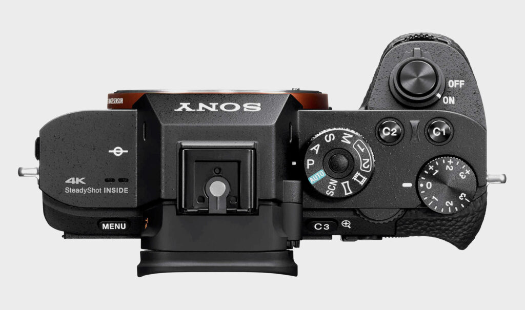
Some of the best user experiences for electric devices mix both touch screens and physical buttons such as Canon and Sony cameras. The important buttons are physical buttons that are easy to reach while their touch screens handle less time sensitive actions that require more attention. Check out this review on the best camera menus. Sony have physical buttons you can customise to perform a chosen function.

Remember the epic UX fail of the Apple Touch Bar?
Remember the Apple Touch Bar? Sure, it looked like a fancy strip of glass, but let's be real here - it was about as useful as a chocolate teapot. For most users, it was more of a hindrance than a help. Because who needs intuitive and reliable function keys when you can have a thin strip of unresponsive glass plastic that requires you to take your eyes off the screen just to skip a song?
And let's not forget the sheer joy of having to switch menus and tap your little heart out just to perform basic tasks. Who needs efficiency when you can have a touch bar that slows you down at every turn?
Touch screens secretly hate the visually impaired
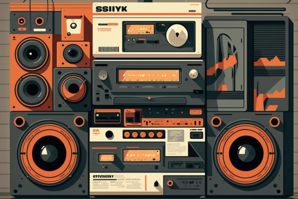
Visual feedback is an issue with touch screens, as they rely heavily on users being able to see the screen clearly. This can be problematic for users with visual impairments as they benefit much more from being able to feel a physical button and gauge feedback through their fingers rather than an often subtle change in light or colour. Efforts have been made to give touch screens haptic feedback but this can’t replace that smooth feeling you had while turning up the volume on your dad’s, ‘this-is-too-expensive-for-you-to-touch’ hi-fi in the 80s and 90s.

While touch screens do have their advantages, such as being more intuitive for certain tasks like scrolling or zooming, they are not always the best choice. It's important to consider the context in which they're being used and whether physical buttons may still be the superior choice.
A UX agency's point of view
As a UX agency, we recommend considering all options before choosing touch screens for your product. Physical buttons may still be the better choice in certain contexts, and they can provide a more intuitive and reliable user experience. So next time you're designing a new interface, don't dismiss the humble button. It may just be the better option after all.
If you need help designing your next interface feel free to contact us and we can arrange a call.
Written by: James Eccleston - Founder and Creative Director


No comments.