22/12/2023No Comments

5 Fintech trends to watch out for in 2024

Step into the realm of fintech in 2024, where we sift through the buzzwords and jargon to decode what the upcoming year might bring. This article delves into the prevailing fintech trends that are molding the industry, examining the intricacies of embedded finance, AI advancements, sustainability initiatives, the ascent of Neobanks, and the transformation of global transfers.

Embedded Finance

So, what's the deal with these fintech trends? Embedded Finance is like that friend who seamlessly blends into any group, making friends wherever they go. Except, in this case, it's financial services snuggling up with your everyday experiences. Think of it as finance going undercover, incognito style.

Embedded finance is all about weaving financial services seamlessly into everyday non-financial experiences. Picture a coffee shop app making payments as easy as a single click or an e-commerce store offering insurance right there in the shopping cart – that's the essence of embedded finance in action. It's like turning your regular interactions into financial power moves without missing a beat.

The impressive growth of embedded finance

Experts anticipate a substantial expansion in the global embedded finance market, projecting a surge from US$264 billion in 2021 to a staggering US$606 billion by 2025.

As an illustration, Lyft, the ride-sharing app, provides its drivers with a dedicated checking account and a linked debit card. This unique account allows drivers to receive instant payments right after each ride, eliminating the need to wait for consolidated payments weeks later. Additionally, drivers can utilise their Lyft debit card to access and spend their earnings while enjoying exclusive cashback and rewards not available through any other means.

Skynet AI 

Yep, I know, you can’t escape the onslaught of people prophesying about how AI will save the world / end the world / make your job easier / take your job, but here is how it could improve the world of Fintech.

One significant area where AI provides immense value is in risk management and fraud detection. Machine learning algorithms analyse vast datasets in real-time to identify patterns indicative of fraudulent activities. This not only enhances security measures but also allows fintechs to proactively address potential threats, safeguarding both businesses and users. Moreover, AI-driven risk assessment models enable more accurate predictions, helping fintech companies make informed decisions when extending credit, managing investments, and navigating complex financial landscapes.

Another crucial aspect is the enhancement of customer experiences through personalised financial services. AI algorithms analyse user data, transaction history, and behaviours to offer tailored financial recommendations and product suggestions. This level of personalization not only fosters customer loyalty but also assists users in making more informed financial decisions. AI-powered chatbots and virtual assistants further contribute to a seamless customer service experience by providing instant and personalised responses to user inquiries, resolving issues efficiently, and improving overall user satisfaction.

Automating time-consuming tasks

Additionally, AI plays a pivotal role in automating back-office operations, streamlining processes, and improving overall operational efficiency for fintech companies. By automating routine and time-consuming tasks such as data entry, reconciliation, and compliance checks, AI allows human resources to focus on more strategic and value-added activities. This not only reduces operational costs but also minimises the likelihood of errors, ensuring the accuracy and integrity of financial data. In essence, AI is a transformative force that empowers fintechs to operate more efficiently, make data-driven decisions, and deliver innovative and personalised financial services to their users.

For example, Enova employs AI and machine learning in its lending platform for advanced financial analytics and credit assessment. Targeting non-prime consumers and small businesses, the company aims to address real-life challenges like emergency expenses and bank loans without creating undue strain for the lender or recipient.

Sustainability fintech trends


Sustainability has become somewhat of a meaningless buzzword of late with the fintech industry getting in on this whole sustainable living vibe thing. However, the European Commission, playing the role of the sustainability sheriff, is making banks and insurance companies spill the beans on their eco-friendliness with the Corporate Sustainability Reporting directive. This will hopefully force companies to go beyond superficial greenwashing and virtue signalling. It's like a financial reality show, but instead of drama, it's all about being green and clean. 

Leading the charge, some fintechs and banks are already committed to sustainability. Several Neobanks and payment providers are prioritising Environmental, Social, and Governance (ESG) disclosure, creating environmentally conscious financial products and services. For example Triodos Bank publishes details of every organisation they lend to. 

Additionally, fintech and banks are minimising their own environmental impact, with some pledging to become carbon neutral and reduce waste. Aspiration’s goal is to help large enterprises, businesses, and individuals address unavoidable emissions and achieve their climate goals. Their team of climate experts deploys advanced monitoring and reporting tools to ensure every project delivers dependable and permanent impact, strengthens biodiversity, and benefits local communities.These initiatives are expected to influence customer decisions, as a growing awareness of sustainability encourages individuals to choose financial institutions dedicated to social and environmental responsibility. Hopefully these fintech trends will be more than superfical greenwashing.

Neobanks exploiting growing niches 


The meteoric rise of Neobanks represents a paradigm shift in the banking landscape, fueled by a digital-first approach that caters to the evolving preferences of modern consumers. Neobanks, unburdened by the legacy infrastructure of traditional banks, have swiftly capitalised on the growing demand for seamless, tech-driven financial services. These agile entities leverage cutting-edge technology to offer user-friendly interfaces, swift onboarding processes, and transparent fee structures, resonating particularly well with the digitally native demographic. The growth trajectory of Neobanks is indicative of a broader trend where customers increasingly prioritise convenience, accessibility, and a personalised banking experience.

One of the key strengths of Neobanks lies in their adeptness at exploiting niches within the financial market. Rather than adopting a one-size-fits-all approach, Neobanks often target specific segments or demographics that may be underserved by traditional banking institutions. Whether it's catering to freelancers, gig economy workers, or international travellers, Neobanks identify and address niche needs with specialised financial products and features. This targeted approach not only fosters customer loyalty but also allows Neobanks to carve out distinctive market positions in a crowded industry. As Neobanks continue to refine their strategies and expand their offerings, their ability to exploit niches will likely remain a driving force behind their sustained growth.

For example Hyperjar helps you keep track of your money by dividing your budget between what they call Jars. They are basically digital piggy banks that make it easier for you to visualise where your money is going. 

Instant Global Transfers with Comprehensive Tracking

A global shift towards instant payment systems is underway, with an increasing number of national payment schemes adopting this swift and efficient approach. Notably, some of these systems are transcending borders, providing the groundwork for international instant cross-border payments. This significant trend is poised to reduce costs and enhance the overall efficiency of the global financial system. The growing participation of banks in instant payment networks promises both consumers and businesses a more streamlined and effective payment experience. The global expansion of SWIFT GPI is emblematic of this evolution. Operating akin to tracking systems for packages, end users now have the capability to trace cross-border payments seamlessly on a global scale, introducing heightened transparency and efficiency to the financial system.

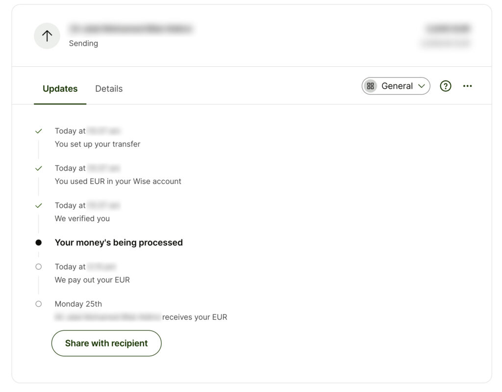
Wise significantly simplifies global transfers, providing tracking methods that alleviate the stress of sending your hard-earned money to a foreign country, especially when you may be unfamiliar with their banking system.
While certain fintech trends in 2024 will catch us by surprise, others, like the inevitable surge in mobile payments, are as clear as day. Predicting the future is a bit like predicting the weather – you might get close, but there's always an element of uncertainty. That's where having an agile design partner comes in handy. Meet Bridge Studio, your go-to boutique UX and brand agency. We trim the fat of bureaucratic behemoths, seamlessly blending into your organisation to provide top-notch user experience and design support. Let's chat about how we can give you that competitive edge you've been craving!

05/02/2023Comments are off for this post.

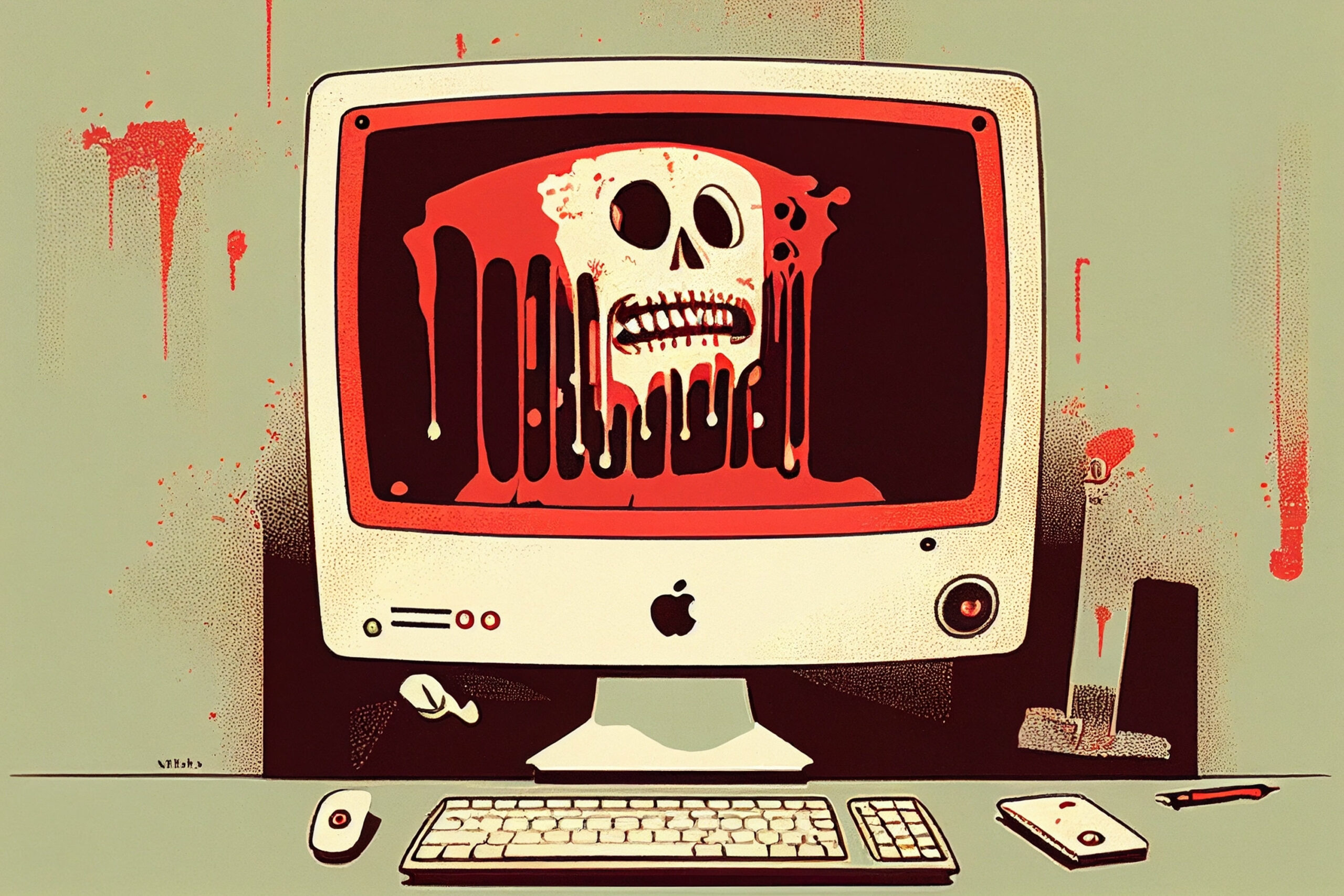
The Horror Show That is Your Website: Time for a UX Heuristic Evaluation!

Ah, the age-old question that has plagued businesses for centuries: how do I make my website actually usable for humans and some of my more demanding clients? Fear not, my friends, for I have stumbled upon the answer. Behold, the magical solution to a big chunk of your website woes: a UX Heuristic Evaluation.

Now, before we dive into the details, let me just say this: if you're looking for a quick and easy fix, this isn't it. But hey, if you're a business owner who wants to make a real difference in your website's user experience, read on!

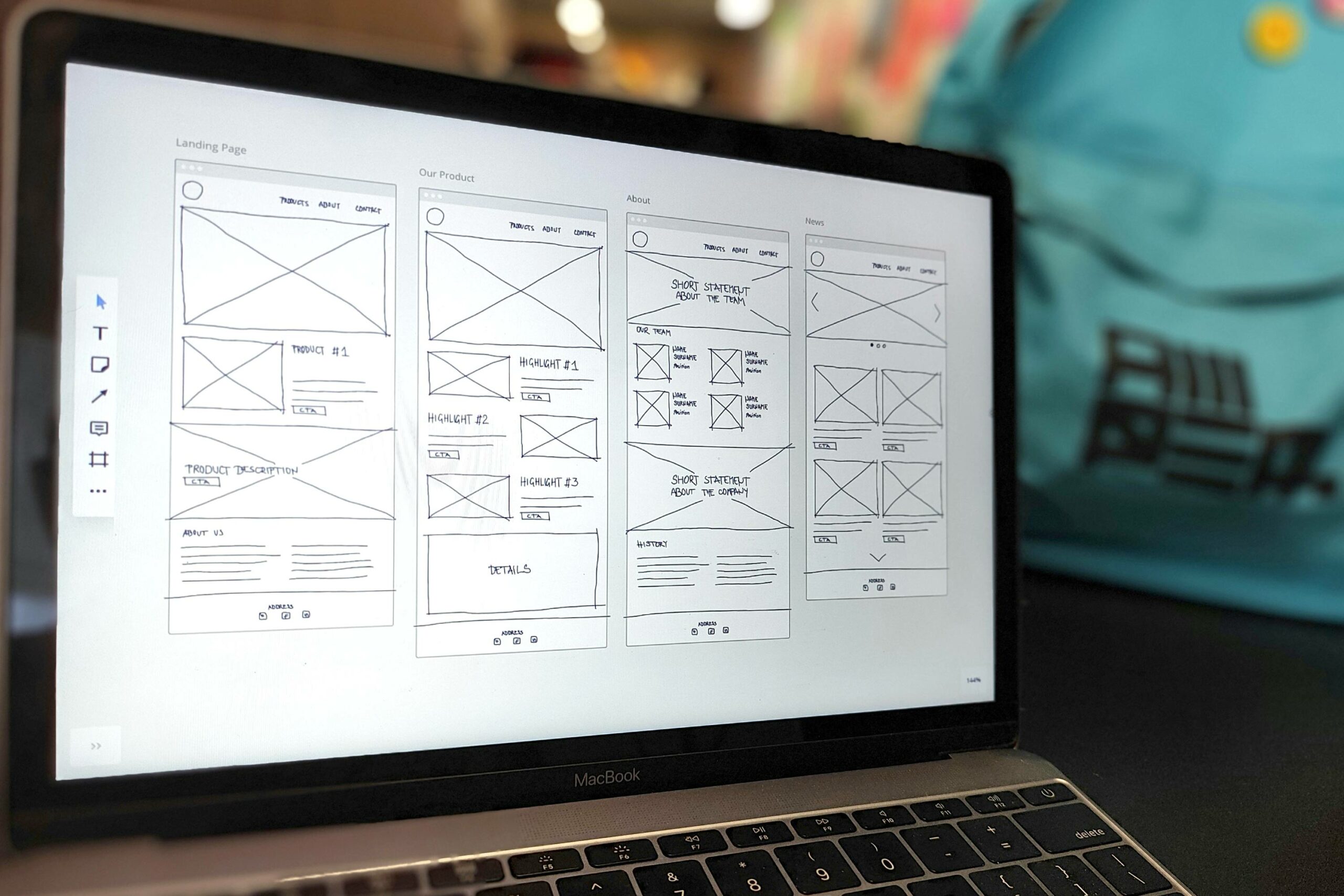
First things first, what is a UX Heuristic Evaluation, you ask? It's basically a comprehensive review of your website's user experience, using established design principles as a guide. It's like having your very own website therapist who's going to help you identify and fix all the little (and big) things that are ruining the user experience. We've taken Jakob Nielsen's 10 general principles for interaction design and given them a good old-fashioned spruce up. It's like adding a cherry on top of an already delicious sundae. And let me tell you, our secret sauce has helped us uncover usability problems faster than you can say 'user-friendly'.

So, why should you care? Well, because no one wants to visit a website that's slow, clunky, and visually unappealing. And let's be real, if you're in the business of making money, you need people to actually use your website. A well-designed website can increase conversion rates by up to 400%, according to our friends at the Nielsen Norman Group. And who wouldn't want to see a 400% increase in their bottom line?

Now that we've established the importance of a UX Heuristic Evaluation, let's dive into how it can improve your website.

  1. Navigation: People don't want to spend hours searching for the information they need on your website. A UX evaluation will help you streamline your navigation, making it easier for users to find what they're looking for. Who knows, they might even stick around longer because of it!
  2. Design: Because who wants to visit a website that looks like it was designed by a five-year-old? A UX evaluation can help you spruce up your design, making it more visually appealing and easy on the eyes. No more eye-strain-induced migraines for your users!
  3. Load times: Nobody likes to wait for a website to load. A UX evaluation can help you optimise your website's performance, so your users can get the information they need in a flash.
  4. Content: Content is king, but it needs to be easily digestible for users. A UX evaluation can help you make sure your content is well-organised, easily readable, and provides value to your users.

So, you've read the above and you think, “Nah, we can do without that UX malarkey” and skip the UX Heuristic Evaluation for your website. Well, congratulations! You're well on your way to creating a digital disaster that will surely be remembered for centuries to come.


The Knights that Say UX
The Knights That Say Ni-elsen

But what exactly will happen if you forgo this essential step in website design? Oh, just a few minor things...

  1. Your bounce rate will skyrocket: With a confusing and poorly designed website, users will have no choice but to flee. They'll run so fast, you'll think you're being visited by the virtual equivalent of the running of the bulls.
  2. Your conversion rates will plummet: Who needs conversions when you can have a website that's designed to drive away business?
  3. Your brand will suffer: Your website is often the first interaction a potential customer has with your brand. By creating a terrible website, you're essentially setting the tone for all future interactions.
  4. You'll waste time and money: Why spend time and money fixing problems when you can just create new ones?

So, there you have it, folks. One of the biggest secrets to a killer website is a UX Heuristic Evaluation. Now, go forth and give your website the facelift it desperately needs. Your users (and your bottom line) will thank you.

Ready to take your website to the next level? Let us do the heavy lifting! Simply reach out to James at Bridge Studio, and he'll be more than happy to get the ball rolling on your UX Heuristic Evaluation. 

06/01/2023Comments are off for this post.

7 Feng Shui-Proof Steps to Choose The Right UX Design Agency

What do Feng Shui and UX have in common? Surprisingly, they are multi-generational long lost distant cousins. While many think UX is a fairly recent field, it has existed for over 3,000 years. It’s hard to believe this statistic because the term “UX” came into the spotlight only in the mid-1990. Although it took a while for organisations to catch on and understand the importance of UX, in today’s hyper-competitive and over-saturated digital world, any company with a website or an app must invest in UX design to survive. Because of this, companies across all sectors are allocating hefty budgets towards the field and trying to figure out how to choose the right UX design agency for their industry and brand. 

UX History, old laptop in stone

A Little Bit of UX History 

So how does an ancient Chinese practice relate to UX? It’s simple. Feng Shui, which translates to “the way of wind and water,” is the art of arranging objects in relation to the flow of energy in a given space to achieve harmony and balance. It’s a way of arranging physical spaces in the most optimal, harmonious, and user-friendly way. Just as Feng Shui specialists arrange interiors to easily navigate the room, UX designers apply similar principles to a website or app to create an intuitive and user-friendly experience. 

Although UX has had many phases, we’ll fast forward to one that put it on the map. Donald Norman, a cognitive scientist, was an Apple employee in the 90s. His job title was User Experience Architect and Donald was the first employee to have UX in his title. He came up with the term user experience design because “human interface and usability were too narrow.” According to Donald, he wanted to “cover all aspects of the person’s experience with a system, including industrial design, graphics, the interface, the physical interaction, and the manual.”

What Is UX Design & Why Is it Important?

Today, UX design can be described as a product creation process that provides meaningful and relevant user experiences. It encompasses the entire process of acquiring and integrating the product, design, branding, usability, and function. According to Jesse James Garret, “UX design is about engagement. It’s not about a specific product, app, or website. It’s about what happens before, during, and after a human interaction has occurred.”

Here are some impactful statistics as to why UX matters:

  • 88% of online consumers are less likely to return to a site after a bad experience
  • 90% of users reported they stopped using an app due to poor performance
  • Slow-loading websites cost retailers more than $2 billion each year
  • Smartphone users are 5x more likely to abandon a task if a site isn’t optimized for mobile
  • 53% of mobile site visits are abandoned if pages take longer than 3 seconds to load
  • First impressions are 94% design-related
  • Judgments on website credibility are 75% based on a website’s overall aesthetics
  • 83% of people say a “seamless experience across devices” is very important
  • 9 in 10 smartphone owners who describe a mobile brand experience as helpful would purchase from that brand again
  • Every dollar spent on UX has a return of $10-$100
Ux design agency office

How To Choose The Right UX Design Agency

These statistics probably got your attention and you might be thinking it wouldn't hurt to reach out to a UX design agency, but you don’t know where to start. We can help! Here are some tips to keep in mind when looking for a UX agency. 

  1. Do Your Homework

Before reaching out to any UX design firm, think about the following questions:

  • Why are you looking for a UX agency now?
  • What problems are you trying to solve?
  • What is the end goal of the project?
  • What is your budget?
  • What is your timeline?
  • What is your ideal workflow & process when working with external firms and agencies?
  • Can you clearly explain your company’s brand and core values? (you’d be shocked how many companies can’t do that)

2.   Niche Experience

Every UX agency has an impressive portfolio with brand-name clients. It is, however, more important to focus on the industries they’ve worked with. If you are a fintech company and the UX agency works mainly with food & beverage clients, it might not be the best firm for your business. Sometimes it’s better to work with boutique UX agencies with a niche rather than large generalist firms. 

3.  Communication & Project Management

Communication is one of the most important elements for a client to feel comfortable. From the very first contact, a client must feel the UX firm’s excitement and enthusiasm to work on their project. It’s not only about responding to questions but taking additional steps to educate them about everything related to the project. 

Feeling comfortable with the project manager’s communication style is also extremely important as they will be the primary go-to person for the entirety of the project. While timely check-ins and updates are crucial, a PM must also possess soft skills. UX projects can be costly and run into hurdles, making the experience overwhelming and frustrating. Having a patient and empathetic PM that keeps you in the loop of everything can make the project go a lot smoother. 

4.   Matrixes & Case Studies

While it’s easy to get distracted by complex interfaces and shiny eye-candy designs, at the end of the day it’s all about numbers. UX is a quantitative and qualitative field with the ultimate goal of helping companies increase their bottom line. Along with before/after design comparisons, potential clients should request statistics and case studies that include relevant metrics and KPIs such as increased sales, page views, conversions, etc. 

5.    Team

Although during the UX agency selection process, clients get courted by founders, senior partners, or creative directors, it’s equally important to meet the entire UX team. Request to talk to a lead designer along with other team members. This not only helps understand the core competencies of different contributors but also determines if the agency has a team capable of carrying out all areas of UX. 

Talking to the team also helps understand the process. While every agency has its own and it changes based on the project, understanding the process helps clients understand what different members bring to the project and at what point. 

6.   Social Proof

Client reviews and testimonials speak for themselves and it’s a great start when researching UX firms. If you know someone that has previously worked with a particular agency, reach out and ask about their experience. It’s also a standard practice to ask the UX agency to provide contact information for previous clients. This can help get an idea of what it’s really like working with them. Third-party review website such as Clutch is also a good resource to get a sense of the UX agency’s work. Last but not least, Google stalking can help gather useful information to determine if the agency is trustworthy. 

7.   Fit & Connection

Choosing the right UX agency is not only about prices, portfolios, and big-name clients. Chemistry is extremely important. It’s a bit like dating. You can be out with the most attractive person, but the spark is missing. There is no connection, and the conversation feels like pulling teeth. This is not your UX design firm. Keep searching until there is chemistry and you both share the same vision and similar ideas. There has to be ease and comfort when meeting with the right UX design firm. Not only will it make the project smoother and more enjoyable, but it will be easier to iron out hick-ups that may arise. 

In Conclusion

UX is evolving and many organisations are finally embracing the field. Finding the right UX firm can be intimidating because many still don’t fully understand the industry or speak the language. Busy professionals can benefit from a quick Introduction To UX Design workshop to equip them with an understanding of the field and make them better equipped to choose the right UX design agency for their organisation.

Written by Juliya Obukhovskaya

21/11/2022Comments are off for this post.

6 fintech UX design tips to keep ahead of the game

Gone are the days when UX/UI designers ran for the door when their firms announced projects with financial institutions. While the financial sector was known to be a dinosaur when it came to web/app design and experience, many financial companies are forced to abandon their ancient design comfort zones in order to survive. In the last 10 years, a surge of fintechs has fuelled design, UX, and UI innovation, allowing them to take market share from traditional financial organisations.  

Africa’s fintech design leaps 

While the UK and the US are credited as the birthplaces of fintech design innovation, interestingly Africa’s M-Pesa has been one of the first pre-global financial crisis fintech companies. M-Pesa’s goal was to solve a big problem, to provide financial inclusion to un/underbanked communities lacking access to banks and traditional financial products. Although fintechs grew with smartphone adoption, M-Pesa initially offered virtual banking services through a simple SIM card to mobile phone users, giving financially excluded communities financial freedom and life quality improvements.  Africa’s fintech innovation was driven by the need to resolve many financial pain points, making many of their innovative solutions ahead of the times.

mpesa app

Today, the fintech sector has set the bar high when it comes to UX/UI design. The industry has established itself as a design leader by abandoning outdated and complex legacy practices while adopting effective and user-friendly designs and practices. Fintech apps now serve as examples for many industries of how effective UX/UI can completely transform the customer experience, improve the customer journey, and increase loyalty. 

Let’s take a look at what Fintechs are doing right in UX design:

Minimal UX design by Bridge Studio

1. Less is more - simple and digestible fintech design

Digital financial products (along with the ops processes) can be complex and confusing for customers to understand.  To address that, website and app designers have to incorporate a user-centric approach taking the following questions into consideration:
  • Is the provided information exhausting and/or overwhelming?
  • Is complex financial data presented in a simple and easy-to-digest way?
  • Are users able to easily find the necessary information to perform the desired action?
  • Are calculations presented in a meaningful and educational way?

Data visualisation tools such as graphs and pie charts are pivotal in presenting complex information in a digestible way. Users no longer have the capacity, or attention span, to read confusing and dense explanations. A quick glance at a simple yet visually appealing infographic is enough to relay all the necessary financial information.  Not only does this improve the visual appeal and aesthetic, but it also retains users and boosts engagement. 

KYC design by Bridge Studio
Bridge Studio's KYC design for Homeland

2. Double-edge friction sword

Friction is an app and website killer. Anything that prevents a user from accomplishing their goal increases the chance of abandoning the app altogether. Designers must create a smooth and seamless process that matches a user’s natural sense of order and logic. 

Providing users with a frictionless process is something that fintechs have excelled at. Incorporating KYC protocols into the onboarding journey has made it a lot easier for users to sign up and use digital financial tools while fulfilling a fintech’s compliance protocols. Other processes, on the other hand,  should not be so easy. Adding some friction serves as a protective layer, especially where financial mistakes and losses can be made. Creating a process with “the right level” of friction adds a safety net preventing a user from making an irreversible mistake.  

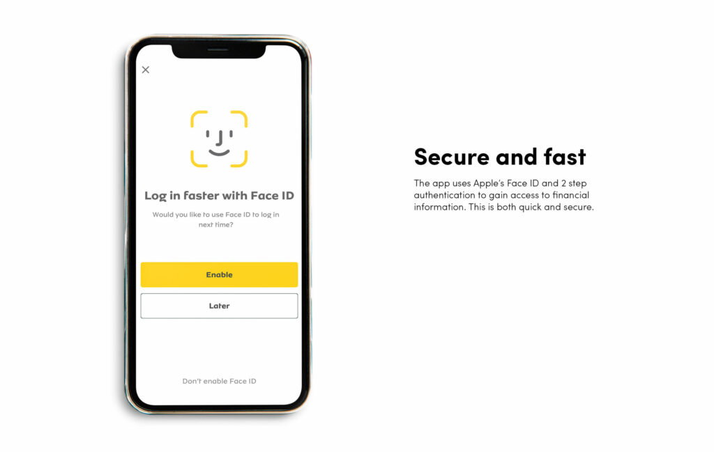
Secure design

3. Trust and transparency

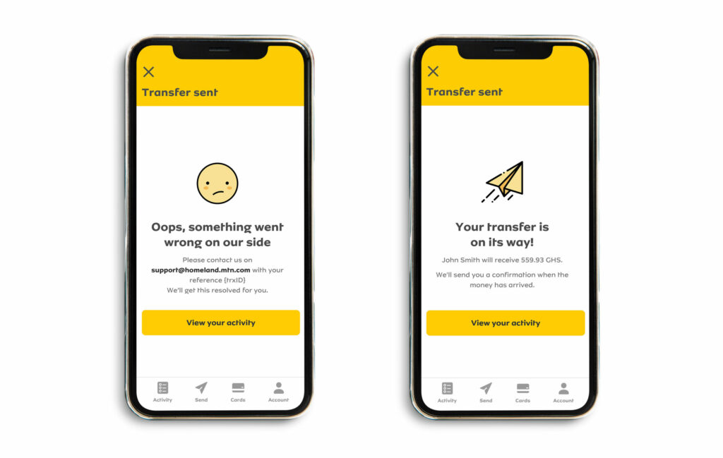
Simple and clear communication throughout a digital journey gives users trust as they confidently navigate their transactions. A user cannot be left to wonder whether their action has been performed or effective. They must always understand where they are in the process in order to avoid confusion or duplication which can lead to app abandonment. To avoid frustrations and app distrust, designers must incorporate the following into their design:

  • Provide simple and clear information about where users are in their process and what each action accomplishes.
  • Guide the user through their journey by explaining the outcome of each step. 
  • Show the user’s progress such as verification, evaluation status, or document uploading.
  • Incorporate encryption, biometric security, etc to ensure the user feels their information is safe.
Conversational tone of voice example

4. Engaging, conversational, and personalised user experience

Users are tired of dull and formal tones, as they tend to overwhelm, confuse, and bore them.  Today’s fintech apps have incorporated personalized user design and communication that transmits positive emotions and interactions in their users’ language.  Here are some additional tips for creating an engaging and personalized user experience:

  • Use visuals, illustrations, iconography, animations, and micro-interactions.
  • Microcopy tone should be conversational, making users feel they are guided through the process instead of feeling burdened.
  • Process flow must be smooth and clean. Thoughtful minimal design is more effective than overloading the interface with pointless text and features.
  • App design has to be aligned to business goals and target audience. 

5. Finetch design leading to positive behaviour & habit formation for the user

Today, it’s not enough to design an app that gives users expected functions and information about their finances. Designers must go a step further and provide functions that help users make the right decisions. Many apps are providing value-added services to encourage positive habits with the following strategies:

  • Offering rewards for accomplishments, positive behaviors, or completing educational content. 
  • Adding alarms or friction layers when users engage in “negative behavior” such as overspending or not meeting their goals.
  • Using gamification to educate or earn rewards and badges.

6. Focus on emotions

With so many product and service apps to choose from, the ones that stand out focus on having an emotional connection with their users. Fintechs, among other industries, have tapped into this by showing they care about their customers rather than using self-promotional tactics to talk about products and services.

Apps and websites that stand apart from the masses focus on purpose-driven, human-centred and soulful design that relates to human values while empathising with the needs and pain points of end users at each step of the product design. This means there has to be a mindset change where with every design project, priority must be given to serving over selling, emotions over information, solutions over features, disruption over protection, and flow over fragmentation. This ensures the design approach is always human-centred gaining the trust and loyalty of end users. 

Fintech design conclusion

Developing and creating any app is no easy task, and in today’s oversaturated landscape user-focused and empathetic UX/UI design helps companies stand out in the sea of competition. If you are creating a new fintech or need to re-evaluate your current UX/UI design and processes, Bridge Studio can help you with your branding and user experience needs to not only connect with but also retain your audience. 

Written by Juliya Obukhovskaya, Bridge Studio content writer.

06/01/2022No Comments

What’s Wrong with the Atomic Design System?

Atomic Design is a way of organising a design system from small components to large components. These components are referred to as atoms, molecules, organisms, templates, and pages. They all work together to create an effective interface design system. An atom is the smallest building block and combines with other atoms to form molecules. A button is considered to be an atom and when combined with other elements like an input field it will create a form which is considered to be a molecule.

UI elements

The Atomic Design System Flaw

Sounds great eh? But wait, Atomic Design has one flaw that makes it difficult to work with.

So you've organised your design components into atoms, molecules, organisms, templates and you feel like some kind of design god. Then you come to look for those components when building a design like a form on a website. In your design god head, buttons and more complicated things a dropdown button are fairly similar. But according to Atomic Design they sit in two different categories. We have now encountered the problem that is technically know as, "Is this an atom or a molecule, what the hell is it, Jimmy?".

They are both navigational tools that should sit somewhere in the same group but in Atomic Design they are split based on their complexity. It would make more sense to organise components into groups based on their functionality.

Atomic Design's flaw

At Bridge Studio we encountered this problem when creating a design system from scratch for one of our clients. Atomic Design was actually a useful frame work to use when creating the components. We started with the smallest components then worked our way up to combining them to create more complicated molecules and organisms. However, halfway through this we realised it's flaw. We decided to finish creating the components in this manner and then reorganised them in a more logical way after.

Our design system

This is how we organised our design system for our fintech clients.

Foundation

This is the core of our design system and will effect everything going forward. It contains the following elements:

  • Colour
  • Typography
  • Spacing
  • The grid

Components

These are the building blocks we use to create our pages. They are then divided into sub groups based on functionality. This section also include things like modal windows that contain various smaller elements. Here are just some examples components:

  • Buttons > Buttons with icons, dropdowns, dropdowns with search, etc.
  • Icons
  • Input fields > Search, text inputs, date inputs
  • Selectors > Check boxes, Radios, Toggles
  • Date picker
  • Modal popup > basic alerts, popups with text inputs

Components

These are pages that have examples of the most common UI elements. They show how the design system works and also serves as starting templates when creating new designs. Here are some examples:

  • Home page
  • Sign up page
  • Contact page

This is how we went about organising our design system but I'm sure there are many other ways of doing it. This is just what suited us at the time.

Advantages of this design system:

No illogical boundaries between sections.

Disadvantages of this design system:

It can create long lists of components that take a while to search.

At the end of the day design systems are humongous beasts that will take some time to tame. Because of their complex nature they will always be difficult to organise. It does take time to get to know how to use them but if created correctly they will be a great asset for your team.

Want to know how Bridge Studio could help you with digital products?

Contact us

17/11/2021Comments are off for this post.

The Beauties and the Beasts of Financial Branding

The financial services industry has been undergoing a slow and painful transformation in the last 20 years. A new generation of fintech brands have lit a fire under traditional banks’ arses not only go digital, but to also think about visual website and app identity, user experience and overall branding. This digitalisation push has been further catapulted by the millennial head down generation of smartphone addicts and the recent pandemic which has given consumers a not-so-gentle nudge to interact digitally with their banks. A recent study found that today, 57% of consumers prefer internet banking and 55% prefer banking mobile apps. 
Man on mobile while waiting for a train.

While banks are scrambling to improve their digital presence, Fintechs are light years ahead focusing not only on their brand and products, but overall UX and UI usability. Why? Because they understand the importance of providing their customers with a positive experience which in turn strengthens their loyalty. Knowing this, Fintech brands make it rain and invest heavily in their end user. According to 2020 S&P Global research, traditional banks spent $30 billion on digital transformation while Fintechs spent $111 billion.

Let’s take a look at what differentiates the Beauties from the Beasts in the world of branding and UX.

The beastly traditional bank user experience

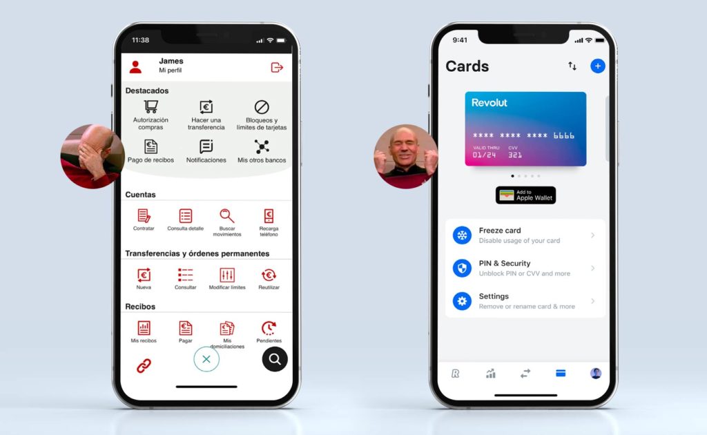
Let’s look at an actual experience my friend (let’s call him James) had recently. James lives in Spain because he loves beer & tapas and naturally he has an account with a Spanish bank from the north of the country to pay for his vices. He wanted to use the bank app for a simple (at least that's what he thought) transaction–change his pin. Once James logged in, this is what the main menu looked like:

Menu UI

Pure horror! The menu is crowded and confusing. The icons are inconsistent and not intuitive. Which one changes the pin? Beats me.

And let’s talk about these colours… cold, sterile, no life or personality. The overall feel is confusing, stuffy and corporate. 

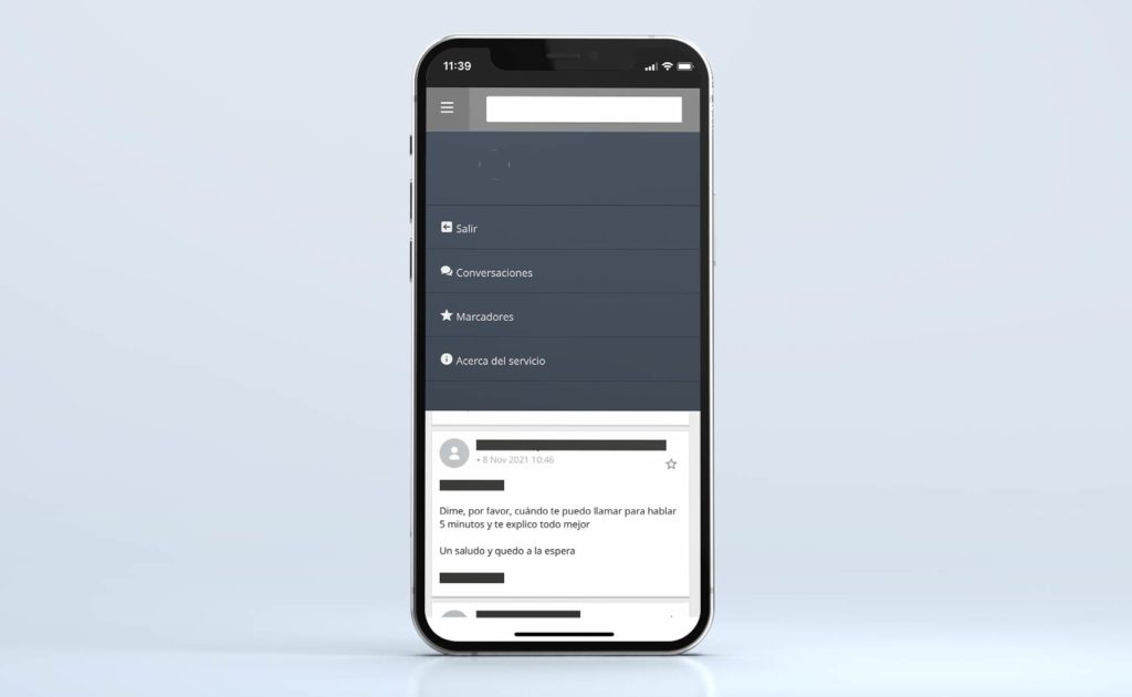
As smart as James is, he couldn't figure out how to change his pin so he decided to have a chat with customer service. Let’s look at the chat bar.

Chat UI

The chat menu UI changes completely from the main menu. Is that intentional or an oversight? Who knows… And what’s up with the huge grey space between SEARCH and SALIR. 

In the end, was James able to reset his pin? Well……. Yes and no…. He wasn't able to do it online nor did the chat customer service provide him with any “service”, but he did take an hour out of his work day to walk to his bank branch where he manually changed his pin. Customer service, UX and UI at it’s best! Major fail.

The new sexy fintech brand beauties

The financial sector was never considered a “sexy” industry, but the fintech industry changed all that. The new kids on the financial block are creating ripples in the world of apps, branding and UX to keep up with needs of end users who are seeking easier and friendlier digital tools and experience. To cater to their customers, fintech brands such as Revolut, Wise, Monzo and N26 have raised the bar for app design, branding, UX and UI, making the sector nouveau-sexy.  How? Here area just a few things…

User-friendly experience 

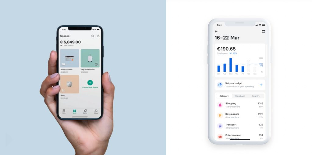
While the finance world can be complex, confusing and overwhelming, fintech brands are essentially solving those problems by simplifying the process and information aggregation for the customer. Not only are the apps simple and striking, but the user interface is more intuitive making a customer journey easy and less frustrating. The home section presents everything in one place, with clear design that’s easy to navigate. Fintech brands stick to the “less is more” strategy providing only the essential info and keeping all the complicated data available behind the scenes.

Good UI design

Keep the user experience simple AND easy

Customers want to understand their finances in a quick and digestible way. Fintech brands converted these problems into opportunities by providing “complex” data in a visual and non-complicated way.  The financial info is presented in a simpler and playful way which doesn’t complicate or overwhelm the customer.

Good and bad examples of UX design

Don’t be a square brand

Traditional banks have strict branding guidelines guided by boring colours and literal names (RBS-Royal Bank of Scotland or Bank of England). Fintech brands, on the other hand, think outside the box and push their creative boundaries when it comes to finding catchy names and thinking about their brands. The colors are bright, the names are fun and the overall tone is friendly and inclusive.

Trust is king for fintech brands

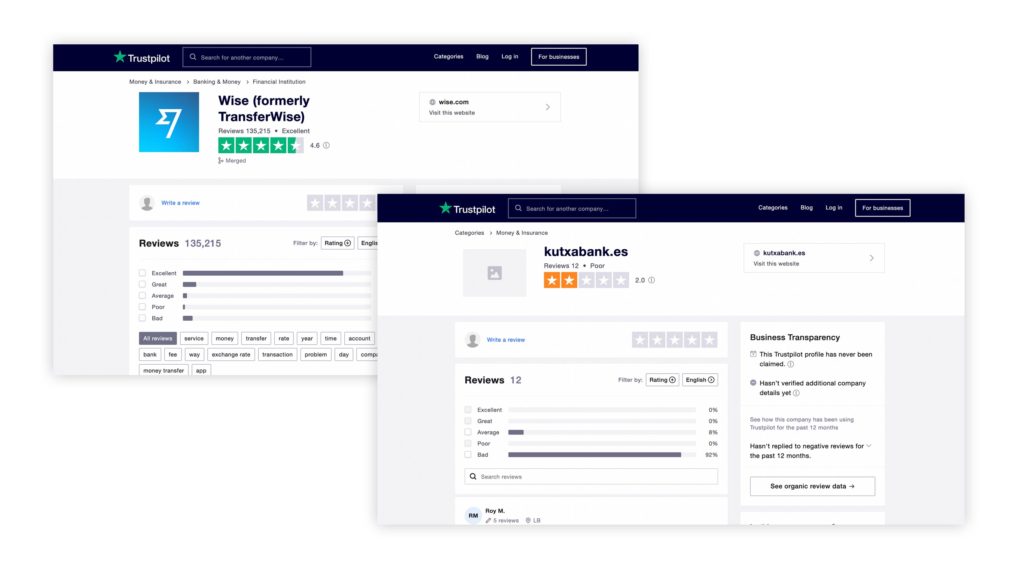
Fintechs brands are the new kids on the block, 100% online and lack physical branches where customers can have human interactions and build trust, which is extremely important when it comes to handling money. They rely on social proof to build brand loyalty, communicate their values, solutions and social responsibility. This “social influence” is pivotal and must be visible everywhere: on websites, social media channels, company blogs and all fintech brand communications. Some additional ways fintech brands build trust are customer testimonials, Q&A, and rating.

Bank review on trust pilot
This says it all...

Fintech Brand tone of voice

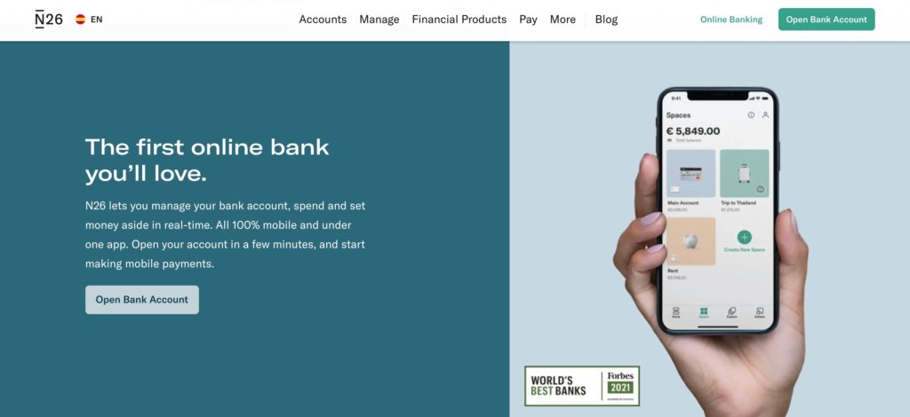
Along with making fitech brands visually cool and sexy, they have also changed the way they communicate with the customers. While traditional brands adhere to a formal, cold and impersonal tone, fintechs have made it friendly and fun. The language is more “human” and warm, creating an emotional connection with the customer.

Human tone of voice example. "the first online bank you'll love."

Today, having a financial product online is not enough to survive. Keeping brand and user experience in the frontlines is what separates the traditional financial beasts from the user-obsessed fintech beauties. 

If you are creating a new fintech brand or thinking of a make-over, we can help by creating a customised workshop to move your brand forward with a clear set of actions.

By Juliya Obukhovskaya, Bridge Studio Content Writer

13/03/2018No Comments

How to improve your focus


Do you remember that guy who got caught doing that thing to that wolf and the best thing was… oh wait a moment I just got a message… oh yeah, the time when Chris… 2 secs, gotta take this, it’s really important, so sorry… Anyway, the police told me that… shit, I have to go, let’s catch up soon… sorry, when? I’ll pm you on Instagram…

Being able to concentrate for prolonged periods really makes a difference to the outcome of your tasks. Shallow and fragmented thinking is the enemy to good work. I’m going to share with you some of the things that help me get shit done. Some things might be obvious but in any case I hope at least some are helpful.

1 De-clutter to focus more

De-cluttering helps remove distractions. This should be considered in the physical and emotional sense. Let’s start with the mind. Before going to bed I find journalling about the day helps empty my mind of all the nagging clutter. I list all the major events that happened that day, this is a bit like backing up files from your hard-drive before cleaning it. It also helps you remember things to act on the next day.

De-clutter your work space. There has a been a lot said on this already so I won’t go into much detail. You’ll have more space to move and be less stressed. A messy work place is also really distracting, oh look there’s that note I wrote about that wolf a month ago…

2 Block out distractions

Open plan offices are cool but can be really noisy and distracting. Even though my office in Madrid is pretty small it can get quite noisy. Yes, I know how noisy Spanish designers can be…

One way of blocking unwanted p̵e̵o̵p̵l̵e̵ noise is putting on your headphones and selecting your favourite playlist. However, I find it hard to concentrate while listening to music, especially when writing. On www.noisli.com you can create custom background noise. It surprisingly filters out any unwanted noise. If you really want to listen to music there are plenty of playlists on Spotify that have unobtrusive tracks. I find repetitive deep electronic music the best. It makes me feel like a design robot from the year 2000.

You already know this but social media is a rabbit hole of distraction. Of course you just had to check that thing but now your looking at a video of that guy, the wolf and the Tory MP, how did it get to this? (I mean you looking at the video, not the Tory MP and wolf, we kinda already know what they do in their spare time.)

I use the Chrome extension Stay Focused, to stop me laughing all day at dodgy politicians.

1_CJcyVxf74kFdTq5qH-rGhg

3. Organise

It’s easy to get distracted when you have no plan. I use a combination of Trello, Pomello and Google Calendar.

I organise Trello in the following columns. On Hold, This week, Today, Sent for feedback, Approved, Invoice sent, and Paid. I then time block the projects for this week in my Google Calendar. It helps to leave some buffer time as not everything goes to plan. Pomello is a timer that syncs with Trello. It gives you 25 minutes blocks to work on projects then 5 minutes rest. I feel a lot more productive when I know I should be working on something and not wasting my clients time on social media.

It also helps to block in time to read mails as this can really break your working rhythm. I try to keep my inbox down to only mails that need to be acted upon. The rest get filed away.

1_Xn1cB4ESzVhXDMv-tQQ71A

4. Calmness helps creativity

We all know how meditation helps you focus. For me it’s helped me be more conscious of my thoughts and their origins. Meditating everyday will help you focus on your task by quieting your chattering brain.

1_-dMpKM0KhAzByAJ3QHp0-w

“Compared to non-meditators, meditators had more stability in their ventral posteromedial cortex (vPMC). The vPMC, a region linked to spontaneous thoughts and mind-wandering, lies on the underside of the brain, in the middle of your head.” Psychology Today

5. Exercise improves creative focus

If you’re sat down all day you’ll probably need to compensate by having a good workout routine. Exercise can help impulse control by triggering endorphins, which improve the prioritising functions of the brain and in the long term it can help starve off brain ageing and Alzheimer’s.

6. Creative Environment

If these tips above don’t seem to be working try working in a different location. I find my productivity is boosted by spending a few hours working in a cafe or different part of the office.

7. The Drugs

The short term advantages of drinking coffee can be considerable but in the long term you’re just robbing yourself of future energy. Look at it as a kind of nitro boost in a computer game that uses up your fuel faster than normal. Alternatively, tea can give you a more subtle boost without the crash associated with drinking coffee.

1_3WcEMrX4rJCG1bkjYd14rA

If none of the above are working it’s probably Friday afternoon, in which case you should consider swapping the mouse for a pint of some kind of intoxicating liquid, if not the hand of someone close.

Here’s the summary:

1. De-clutter
Journal at night
Keep a clean working space

2. Block out distractions
Noisli
Spotify — concentration playlists
Stay Focused

3. Organise your day
Trello
Time block with Goolge Calendar
Pomello

4. Calmness & De-stress
Meditate

5. Exercise

6. Change your environment
Work in a different room or go to a cafe

7. The drugs
Use coffee sparingly and try tea

Would you like more focus in your organisation? Take a look at how we could help you with our workshops.